I added uniform noise. Originally, this was in order to hide the artifacts introduced from increasing the saturation, but I liked the look of the noise anyway. I don't recall exactly how much noise I added. I think it was around 10%, uniform. -- Victor
Guest
24-Nov-2005 04:19
why so noisy for iso 100? PP?
Guest
22-Nov-2005 02:40
I like the various gradation of color the spring has generated. Very nice. -Cat
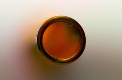
In response to the thread on dpreview asking us to explain our thinking in designing our pictures, here is mine:
I was cleaning up a table with an assortment of photographic equipment. I saw the spring and thought it might make a good subject. It's a familiar enough object, but maybe if presented in an unconventional way, I would make it abstract. I photographed it in front of a white background thinking that I'd later make adjustments in post processing to make it a uniform color (other than white). In tinkering with the image, I noticed this wonderful color when I goosed saturation. I was really hoping the interior would be a consistent color, but such was not the case. Rather than paint a solid color, I decided to just go with what I had. By the way, the saturation is boosted so much that I had to do it in 16 bit mode in order to suppress quantization artifacts. Even at 16 bits, some interesting stripes were introduced. While interesting, those stripes detracted from the theme. Striving for the simplest possible image, I therefore added a layer to blur out the stripes keeping the coloration as simple as possible. I toyed with changing the color balance or something else on the outside of the spring. In the end, I decided that simply leaving it alone (after boosting saturation) was the best bet. I also toyed with the idea of either enhancing or suppressing the detail of the spring visible to the left in bokeh, and even to a lesser degree inside the spring (to the left of the right edge). I decided that this is a photograph, after all, and that leaving a hint of detail was fine. As I already described, my choice of subject placement was also designed to be minimalistic. By not preferring one side or another, I hoped to preserve the essence of the circle. Finally, I added uniform noise, not to add texture, but to remove evidence of the striping I referred to earlier. So it was an effort to reduce texture, not increase it. -- Victor
Thank you for your comment. The framing was somewhat limited by my choice of lenses. I will probably reshoot with the 12X instead of the 24X, and after cleaning the spring. It's amazing how much dust shows up. This image took a lot of dust removal work. I sort of had the Japanese flag in mind as a model for framing. The spring was not quite centered as shot, so I carefully cropped something on the order of 20 pixels both vertically and horizontally before resizing in order to get the circle exactly in the center. I also wished I had more control over the lighting. This picture was taken with the camera's built-in flash with pieces of paper held in strategic locations for fill, etc. -- Victor
Victor, I really like the colors of your spring and the inner circle of the spring.
I think if this took up a little less of the frame and / or was in the "thrids" area of the frame, I'd like it even more. Nice work. Markjay