photo sharing and upload picture albums photo forums search pictures popular photos photography help login
Canon DSLR Challenge | all galleries >> Challenge 12: Light (Hosted by FretNoMore) >> Challenge 12: Eligible > * Power
by Tabs
previous | next
29 March 04 Tabs

* Power
by Tabs

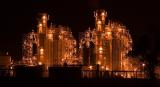
Part of a power plant near Houston, TX


other sizes: small medium original auto
share
Olaf.dk 06-Apr-2004 12:46
IMO, the color does add something! --Olaf
Guest 02-Apr-2004 13:13
Both versions are excellent, but I prefer the color, too. It's a surreal scene, and the warm colors emphasize that.
Canon DSLR Challenge02-Apr-2004 01:12
Well after looking at both off and on all day I'm back with the color one.. a little crop off the bottom and a tad off the right side :) It did occur to me that I could colorize it green and call it the Emerald City from Oz :) -- Tabs
Guest 01-Apr-2004 14:51
argh guest was me - Tabs :)
Guest 01-Apr-2004 14:51
Thanks for the comments, everyone - I really appreciate the thoughts and input. I keep vacillating between the color & B&W myself and I find it interesting to hear the reactions each get. It's going to be hard for me to choose which one to have up when voting begins :) Any rules on entering the same photo twice? LOL :)
Canon DSLR Challenge01-Apr-2004 06:25
I like the color version better too, but I prefer color over b&w in general. This b&w picture works but it's a bit flat to me. For this version maybe you could try to also crop out the faint lights on the far right, that I think would make the picture even more abstract.
-FretNoMore
Guest 01-Apr-2004 02:30
Woah, I miss the color. The image feels like it has more depth in the color version. It looks too flat and abstract now. And I disagree on the crop. Well at least I dont like how close the left structure is to the side of the image compared to the right structure and it's side. I don't miss the space on the bottom, but I definitely miss the space on the left side. The image looks too off-balance now.

You can't please everyone. So you got to please yourself. Someone famous said that. Something about a garden salad... yeah that's it. :)
Canon DSLR Challenge01-Apr-2004 02:29
The bw is more abstract and that works for me. I like that there are two of them. Adds to the abstract feeling. Ann C
Canon DSLR Challenge31-Mar-2004 19:37
Looks really nice in B&W, have to confess like it better than the colour version. Very well taken.............. Vikas
Teapot 31-Mar-2004 12:15
Love the B&W Tabs. Didn't see the colour version, do you have a link for it?
Canon DSLR Challenge31-Mar-2004 04:39
Thanks for your help and suggestion - I like it better this way too :) -- Tabs
Canon DSLR Challenge31-Mar-2004 03:09
That edit is A LOT stronger, in my opinion. Nice work. I think that's good enough to replace your original upload!

- David McGaughey
Canon DSLR Challenge30-Mar-2004 19:48
Solid composition. Have you considered making this black and white? I do not think the color is adding anything to the picture.

Also, perhaps you could crop a little tighter; ie remove some of the dead space on the bottom and that structure on the far left. That would give the subject a little more emphasis.

- David McGaughey
Canon DSLR Challenge30-Mar-2004 12:59
Well shot! -Ed Hahn
Guest 30-Mar-2004 06:57
Very cool! I like the almost-symmetry as well as the lighting.