Inverness Gold is part of Cambria’s Marble Collection™. It features golden streams weaving through a crisp white backdrop, creating a lively and energetic design. The embossed patterns provide a striking contrast, offering a naturally inspired motif with a softly tactile allure.
"Inverness Gold pairs beautifully with a range of design elements.
Here are some complementary ideas to enhance its stunning look:
"Cabinetry: Warm Wood Tones: Cherry or walnut cabinets will bring out the golden veins in the countertop."
We have solid cherry cabinets.
"Flooring: Warm-toned wood floors (like hickory or oak) complement the gold veins" Our new floor is hickory
"Fixtures: Brushed Gold: Faucet and hardware in brushed gold or brass coordinate seamlessly."
This is the way we plan to go.
"Accessories: Natural Elements: Incorporate greenery or wooden decor to add warmth."
We just ordered two Kohler "Aspen Green" sinks. A plant shelf in the bump out kitchen window (made from Inverness Quartz) will also hold the greenery of living house plants
"Metallic Accents: Gold or brass accessories tie in with the countertop's veins"
Our cabinet hardware is antique brass.
An Inverness countertop seems perfect for our kitchen make over. It looks like the kitchen ideas are now going together for a warm, traditional kitchen filled with a strong modern 2024 vib.
*******************
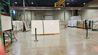
The slab wasn't yet on the showroom floor; so, this photo was taken in the "warehouse" portion of the local Cambria showroom. The above slab photo still has plastic covering it. This is the polished version of the Inverness design; so, you can see how much lighting reflects off the slab. Feeling this is a negative, I have decided to instead go with a custom order of unpolished, which looks more like natural marble. Without the glossy finish, our countertop won't be notably affected by light glare on a shiny surface. I originally thought I preferred polished, but seeing the matt and polished finishes side-by-side, the matt looks much richer and will look better in our kitchen that gets a lot of natural light.
No, we haven't ordered it yet.
But I have now narrowed my choices down to this. The tiny sample (smallest one on the far right of this photo https://pbase.com/image/174960449) goes very well with our cherry cabinets and the new hickory floor. Seeing a full slab (alongside of Brittania Gold Cool https://pbase.com/britestar/image/174945274 ) has convinced me to with to go with a less busy pattern; rather than with the one I originally thought I liked best in a small sample. I love the marbel look - with the gold veins of the Inverness design - in the matte finish.
Copyrighted Image. DO NOT DOWNLOAD, copy, reproduce, or use in any way without written permission from Elizabeth Bickel.