photo sharing and upload picture albums photo forums search pictures popular photos photography help login
Konica Minolta Users | all galleries >> KM Challenges >> C37 The Blues: Hosted by Sergio Rojkes >> C37 The Blues: Competition > +Chicory Flowers by S. Walker
previous | next
28-JUN-2005 Stephen Walker

+Chicory Flowers by S. Walker

Bellefonte, PA

First Submission -- Hope I don't screw this up.

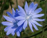
This is a plant that I've always known as "Chicory". It grows along the roadside all over the place around here and I've always loved the pretty blue flowers. I've cropped the image, desaturated the background and increased the color saturation of the flower by about 25%. I'll post the original in the other gallery.

Konica-Minolta DiMAGE A2
1/200s f/10.0 at 50.8mm iso64 full exif

other sizes: small medium original auto
comment | share
Guest 01-Jul-2005 15:32
Thank you very much for your wonderful complements and helpful criticisms. I've been fiddling with the image in photoshop over the past couple of days. I wasn't totally happy with the completely colorless background so on the new version I have desaturated the background somewhat but left it with some color. And I fiddled with the color of the flower a bit to try and get a really nice blue without getting something that looks unrealistic.

I do have the flowers as a layer in Photoshop, so extra manipulation is no big deal.

-Steve
Guest 01-Jul-2005 07:15
It's good to see you taking part Stephen. I like to see some variety, so I'm enjoying seeing your original and this one as alternatives. I actually prefer the background of the original, but this also works. Good composing/cropping and the flower layers created by one over the other works well to make one more the focus than the other. If you'd left the background as it was, further saturation of the flowers wouldn't have worked without just selecting the flowers. However, given that you chose to do it this way, further saturation is a real option. Your colours look quite muted and a bit too understated to me, especially for the C37 theme and the nature of your subject, so I'd really like to see more vivid flowers. If I was doing this, I would have saturated a lot more and played with the curves to really bring out those colours and textures, regardless of whether they ended up looking somewhat different from the originals. Depending on whether you shot JPEG or RAW, there will be different limits to how much you can manipulate the saturation/curves before you get a breakdown in the colour gradients to create posterisation (noticeable areas of the same flat colour with no detail). That's one reason I love RAW as it's not only so forgiving but also so flexible because it has at least 16 times the number of steps in colour gradients, so multiplying it does not produce gaps between colours nearly as big as those between the less detailed JPEG images.
A small point about this kind of thing is that it can be tricky to get the outline perfect and I can see some remnants of brown from the background, eg on the three petals at the top left of the lower flower, the edge of the petal in the upper flower sticking up to the upper left and (to a lesser degree) in the gap between the lower petals on the lower flower. Cleaning up those kinds of things makes for a more pleasing result without unnecessary distractions. It takes time, but I think the results are worth it. I wasn't looking for those remnants at first, but once I noticed one, I couldn't help but see some more. For this kind of processing where you do a lot of work, it's also a good idea to save the file with its layers so you can easily go back and retouch with little hassle.
I hope you get the urge to have another go at this one to see what you think when compared to the version you posted. There's potential there for this one to have even more impact.
John
cbses 30-Jun-2005 01:43
Very nice first post - I hope it's not the last. You really have to view the original size to appreciate it. And speaking of original, the shot in the orignals gallery is very fine. I kind of prefer the full color background, although you'd probably need to clone out the chicory in the bottom right and apply the same cropping that you did here.
Bob
Konica Minolta Users30-Jun-2005 00:06
Very nice sharp image with plenty of impact. Great!
Mike Parsons
Dennis Phillips29-Jun-2005 20:10
Nicely composed, with the main focus angling from bottom left to upper right. I particularly like the background. I can tell what it is, but it in no way detracts from the main items of interest. They might be part of the reason this pictures seems to pop so much for me. I really like what you've done. Tlaloc