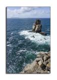
Hi John, I was going to sewer that I double checked the horizon line just before I posted the picture but you were right, just a little bit no totally lined (corrected). I used a polarizing filter in this shot that’s way the see looks so dark, unfortunately the angle wasn’t enough to clear all the see reflections. The sky appears a little over exposed but this was a very tricky situation, the sun was almost in the frame, just some degrees to my left. I have other shots that I took in this same place but I really like this one better, I know it isn’t a BLUE picture for a BLUE theme but I always like to participate in every challenge that I can and when I hear good comments like the one that you posted I consider my self a winner : ). One other thing, the reason for not having the left side of the foreground was because I really wanted to give the idea of fouling, the idea of having just one feet on the ground.
Regards.
Cruz
I do not feel the "infinity" as I can see the ground on the other side. - MCsaba
Guest
28-Jun-2005 13:21
Nuno, good image and a strong idea in the title. I thought the horizon wasn't straight, but I checked and it's only leaning a fraction down on the right, so not as big a deal as I'd thought. The shades of blue are pleasant to look at, but not particularly vibrant for a blues theme, with the sky being quite light and the sea being quite a green blue. I like your positioning of both the foreground rock at the lower right and the rock sticking up slightly further out. It might have been even better if you could have kept the lower right rocks there, but had the other one sticking up on the other side of the frame for a diagonal line through the corners. The other thing that may have helped is the use of a polariser to help tame those reflections off the water to provide a more even and saturated colour. Overall, a pleasing image that is on theme, even if it doesn't jump out and say blue very forcefully to me. John