Thanks for your comments, John. I will experiment more for the next challenge and play around with the cropping on this one just to see what it would look like. I appreciate the input! - Linda
Guest
05-Jun-2004 07:56
Hi Linda,
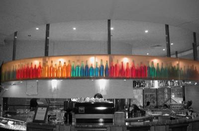
I was a bit rushed last night, so I'll have a closer look now. I still like your effort here very much. I like the band of bold colours running right across the scene with its orange/yellow bakcground to tie that band together. I even like the horizontal symmetry across your pic. One suggestion is to have a look at the vertical symmetry, which I myself would try to avoid with this subject. There's heaps of interesting detail below the bottles and very little above. I would be inclined to include more of the lower detail and less of the above. If your original pic has more stuff lower, you could use that. Whether or not you can include more below, I would be inclined to have a look at cropping the top a bit closer to avoid having the coloured row slice your pic exactly across the middle as it does here.
For a cleaner, more minimalist result, another option would be to crop out the detail from the lower part to leave the focus well and truly on the coloured row of bottles without distraction from the lower detail.
It might be worth having a look at both alternatives against the original to see how each version grabs you.
Cheers, John
Guest
04-Jun-2004 00:42
John, Claudio:
Yep - pretty much it's email when we're competing over something (too tense otherwise), but Jack was good enough to encourage me to enter. Not sure if it was that he wanted to be sure he had someone to beat or just what he had in mind, but I'll be looking to improve with all the valuable input I've found in the forum! Thanks for your kind words! - L.
Guest
03-Jun-2004 15:09
Nice one Linda. Do you and Jack often use e-mail to communicate about your photos, or is only during competitions when the competition heats up? ;o)
Cheers, John