This is how I make a special golden layer with texture like in my Anita's Poppies impressionist and my Fish in Golden Pond picture. I was using PSP X.
This will make you a gold textured painting that you can layer over any painting in Overlay blend mode or Hard Light blend mode for best effects.
Open a 800w x 600h layer. Go to Materials Properties and select Gradient. Pick metal brass which is pretty standard. I previously edited mine to change the darkest color to a lighter one) but it shouldn't matter here.
Pick the Radial box (one on far right) . (I think the default is the one on far left.)
THIS IS IMPORTANT: Angle 27, Repeats 0, Centerpoint 100, Vertical 0. Make sure link center and focal box is unchecked.
Now, Select your bucket fill tool. Fill the space. It should go from light to dark from say 1 o'clock to 7 o'clock for example.
Now, the fun part. Select your palette knife, way at the bottom of your tool list, below pen and warp brush. I like it to be size 50 but not critical. Head loading 40, Thickness 55, Rotation 45, and Head Tracking box selected (should be shaded blue). Normal Mode
Now, Look at your Palette's drop down menu. Make sure Mixer is checked.
Go to mixer. Click on the mixer tube. Now click on your regular foreground color and using the eye dropper tool, click on a light area of your picture. Repeat several times, picking different shades of gold color. You should have something like : R206,G196,B136, and R141,G124,B63, and R116,G98,B41. After you select a shade, make some swatches in the white area of the mixer box. Now just click on the little palette knife and make strokes on the picture, kind of like icing a cake. You are trying to get sort of a hammered gold look so experiment. Now, to Effects>Edge>Enhance and your paint strokes should really be more obvious with some highlights.
At some point your painting becomes Raster 2 Layer so depending on how 'yellow' you want your finished gold to be, you can select overlay or hard light and merge down, or save it like it is.
You can save the image as a psp file, but I saved one as a jpg file so I can use it in Photoshop as a layer over whatever I want.
I'm sure there are lots more ways to do this, like using the brush strokes feature so experiment.
I also like to use the burn tool after applying this layer to really give depth and richness.
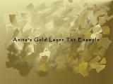
I also like to use some custom brushes while on burn setting to give special effects. Above image is unfinished, but left to show effects better.