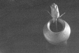
I like this overall, but can't help but wonder if slightly less grain would work better here. There is a blip in the top left you might want to lose and for me anyway the one brighter corner on the lower left is slightly distracting. Nicely composed RK.