photo sharing and upload picture albums photo forums search pictures popular photos photography help login
ctfchallenge | all galleries >> Challenge 120- Dilapidated >> Eligible > Yardage*
previous | next
10 November 2006 Christina Conroy

Yardage*

Los Angeles

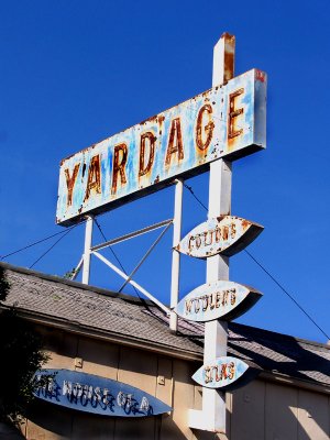
Made it to LA on Friday.
There are dilapidated things there for sure!


other sizes: small medium original auto
comment | share
Rod 15-Nov-2006 07:37
If you're happy then we're happy Christina:-) This one looks good to to me.
Squared C15-Nov-2006 05:11
Thanks Brent and CJ. I'm happy with this one. It's a little darker, but it really just makes the colors more vibrant so really Rod did me a favor in pushing me to work on it. I'm happy with it.
Brent 15-Nov-2006 04:02
Although I prefer this version, the previous one was still very nice. Maybe after being away from living under the California sun for 15 years I prefer things less bright? Burning the white to grey would have been bad, and I don't see that here at all. I think you did a great job with it Christina.
ctfchallenge14-Nov-2006 20:28
Christina, you'll always find differences of opinion in these challenges, and everything else in life! Personally, I think I prefer the bright white version - to me it showed the harsh light of day shining on the dilapidation caused by detrioration of manmade objects. You should always go with your vision of what you were trying to portray though, so whichever version you like, that is what you should exhibit. CJ
Squared C14-Nov-2006 20:22
This is the slightly darker version, sorry, forgot to put that note. I think that this is a little better, and I'm not excited about burning in the white to make it look grey. So I think that it will stand as it is now! I really do appreciate all the comments though! They make me look at my photos a third and fourth time and usually with new eyes.
Rod 14-Nov-2006 19:27
As always Christina you need to make us see how you want the feel of the shot to be, so if the brighter version is wot works for you then that's how it should be:-)
Squared C14-Nov-2006 17:30
Well, it was 80 degrees the day I took this... does that help?

No, I get your point. I've worked on it a little and will upload another version soon! Thanks for the comments!
Rod 14-Nov-2006 10:39
I don't think it matters that the whites are white Christina it's just the perception that it was a bit too bright for some of us for this topic. Say with a topic of mid summers heat then that brightness would have helped the shot.
Squared C14-Nov-2006 06:14
I don't know how I feel about this one. I mean, the whites are white. I'm not sure why I need to make them grey. They don't seem to "hover" into anything else or distort, as I would expect them to if they were blown out, they're just white.

I'll try to take it down a notch... We'll see what happens.
ctfchallenge14-Nov-2006 00:20
Love how the sign stands out against the nice blue sky, even if the whites are a little bright! Nice shadows too. CJ
Rod 13-Nov-2006 08:31
Yes it looks too bright for me too it seems to have exposed for the shadows. I think it can be saved by lowering the brightness in software. Apart from that it's a good shot, well done Christina:-)
ctfchallenge13-Nov-2006 02:12
The whites seem a bit glaring to me, too, but maybe that's just the LA sun.
--Mary Anne
Brent 13-Nov-2006 01:18
This is great Christina! I was just thinking about you living in your newer neighborhood this morning, and hoped you might make it into LA where things are at least somewhat old. Glad to see you did just that :-) I like this a lot. I wonder since it is so faint anyway, if that one wire going in front of the sign should be cloned out? Could be my monitor calibration, but the white looks maybe a little too bright; you might want to fiddle with exposure or maybe do some selective burning- let's see if it looks bright to others. Nice work, glad to see you posting.