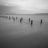
I disagree with the comments about losing some of the bottom space. Yes, it's empty but for me it needs to be empty as the ethereal feel to the whole image needs plenty of cold, open, eerie space. The only thing i would lose if i was going to lose anything would be the buildings on the far left shore as they take away (only slightly) from the desolate feel.
Britt
03-May-2006 15:15
Gorgeous...would love to see the color version of this.
Guest
02-May-2006 20:15
Very Nice Adam!! Great eye. -Cat
(*) I have to agree with Julian. There is nothing in the forground to hold your attention there, so it can go (about 1 inch from the bottom)
I think this shot is beautiful, but I think that I like the crop that you have on your gallery a little better - though even on that one I could use a little more space. But then I think about saying what I just said and I think, no, I like all the space here, it gives me the feeling of such vast distance. It makes me feel that if I wanted to make it across the walkway (if that is what it is!) between now and the next high tide I would have to run.
Indeed a great shot Adam, but I'd crop more to get the horizon up high - the lower ¼ part of the image doesn't do anything for it either - lose it is my advice. A square format is a difficult thing.
I'd also to see a bit more contrast - it's all a bit dull gray imho. You can get a lot more power in this image if you want to.
Julian