photo sharing and upload picture albums photo forums search pictures popular photos photography help login
ctfchallenge | all galleries >> The Best of CTF Challenges >> Best of 2005 > 1st: Tea before bed by Ioana
previous | next
22-MAY-2005 Ioana Drutu

1st: Tea before bed by Ioana

San Diego

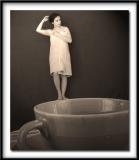
A color version of this image can be found in Exhibition

Canon PowerShot S1 IS
1/8s f/7.1 at 5.8mm full exif

other sizes: small medium original auto
comment | share
ctfchallenge24-May-2005 22:13
Welcome Ioana :-) and what a fine fine entry.

-Techo :)
Rod 24-May-2005 09:09
I think her name derives from the Oztralian Goanna. Pronounced with a G but after a six pack of XXXX it’s pronounced with an I:-)
Guest 24-May-2005 01:26
Ioana, excellent shot! You really did a good job with the DOF. And the lining up of your feet with the cup is just perfect.

About your name, Nugar is right and I realized almost immedately it comes from Juana (spanish), or even more from German: Johanna (where the J is pronounced as an "i").. besides Spanish my second mothertongue is German ;-)

Welcome to the challenge! Such great talents are always welcome. And you will get used to Rod ;-)
Nugar23-May-2005 21:48
Hi Ioana, I love the image, both versions, I love your name and if that's you in the picture I love you too! :oD

Kidding aside, and about your name, I think it is lovely. Although I don't speak Rumanian, I speak Spanish and as I understand both languages come from Latin. So as an extra explaination for English speakers, Ioana, if it sounds as I think would be the same as Juana in Spanish, Giovanna in Italian and Joanne in English. In Spanish it is the female form of Juan (John).
Rod 23-May-2005 19:30
Thanks for explaining the shot Ioana, your explanation makes the shot even more remarkable. All the blokes here had no success getting the apparent depth of field you achieved, & how you lined up the feet on the edge of the cup is a great attention to detail. I'm having trouble deciding between the B&W or the colour one, the surreal nature of the shot I think lends itself to the B&W, just. Fantastic work well done...........It would have a lot more impact without drop shadows & frames as they always detract from a good photo..................A plain border is the most a shot needs...........If you're into scrap booking then I'm sure you will find a use for em:-)
ctfchallenge23-May-2005 17:57
Ioana, first of all thank you for explaining the shot. i appreciate it. i am impressed with your ability to get this much dof in your shot with S1.
there is no restriction on modifying/replacing entry image, so if you feel like putting the colored version here...go ahead.
btw take no notice of Rod's frames-comment. he is just like that :) most of the time, he is too drunk to realize what he is writing anyways :)
-Abstract
Guest 23-May-2005 17:15
No, it is not a composite, and the only PS alterations were cropping, light balancing, sharpening and smoothing out some wrinkles on the "background" (easier to do in Photoshop than actually ironing the red sheet itself :p). I did a couple of things to make everything appear in focus: first, I chose a plain cup, so there wouldn't be fine patterns to give away minor lack of focus. Second, the cup was actually about a foot away from the lens (I was perched on a stool about 15 feet away), and the DOF getts better as you get away from the subject. The focus was locked on me, and this is what came out (I've noticed my camera makes remote objects a little soft, no matter how well they are focused, but does a great job with closer ones, so that played to my advantage).
As far as setting up the image, I put a piece of cotton under the cup, to have it tilted toward the camera. Being able to see some of the inside of the cup makes it look like it was shot from an above angle, and from that angle you would expect to see the stool if there was one. I hope it's clear what I mean.
I also like the vivid colors on the original, and your comment makes me even more torn - maybe I'll put it in the exhibition gallery. And I'll think about the silly frames (I'm a girl, after all...)
Thanks for looking,
Ioana
ctfchallenge23-May-2005 15:00
Thanks for sharing the meaning of your name, Ioana..."given by god"...coool.
btw i like the other version better because of vivid/bright colors and i noticed the cup is also almost in focus (sepia one it looks much out of focus)...so as Rod had mentioned, is this is a composite photograph? as per topic theme, composites are not allowed in this challenge and photographers are supposed to present disproportion through different perspective only. thanks. -Abstract
Rod 23-May-2005 10:36
Welcome to the challenges Ioana:-) Excellent shot & about the best disproportional shot I've seen here, well done. You are the only one that has managed such a wide depth of field with such a close up & you or the modal being so far away. Or is this a composite of two photos? We can talk about the distracting drop shadow & silly frame another time:-)
Canon DSLR Challenge23-May-2005 07:46
I simply love this image.

andy
Paul 23-May-2005 07:17
This reminds me so much of where some brave fool dives from a high board into a small pool of water, it really appears as if you're about to leap off for a splash in a cuppa. Excellent photo.
Guest 23-May-2005 05:42
Thank you all for your kind comments! I am just getting into this photography thing, this is only my second challenge and I still can't believe people actually take time to comment on my pictures. Hopefully I'll slowly learn to become a better photographer.
My name - Ioana - that's really my name, it doesn't mean anything (well, if you look into those name dictionaries that trace everything back to latin, greek and aramaic, it supposedly means "given by God". It's a pretty common name in Romania, where I come from (moved to the US six years ago). Thanks for asking :-)
Now, more to the point - Lee, I've ironed out the wrinkle, thanks for pointing it out. Unfortunately, the graininess is not really a a "treatment" - the background was pretty grainy straight out of the camera. I can only get reasonably smooth images at ISO 50 with the S1, and this was shot at ISO 100 (My apartment is pretty dark, and I can't stay still very long ;-). I chose the sepia because I thought it added a surprise factor- you wouldn't expect an classy, venerable sepia picture to be a "tricky" one, would you? Plus, it goes great with the graininess!
Here's the color version for comparison <img src="http://www.pbase.com/idrutu/image/43737515.jpg"
Ioana
ctfchallenge23-May-2005 04:37
Great idea and compo!! And wonderful sepia tone! -Cat
ctfchallenge23-May-2005 03:57
Ioana, i like the concept. nice work with dof too. i think sepia+grainy treatment is to hide minor glitches of focus. very clever. works well. -Abstract
ps: btw nice name...what does "ioana" mean? i think you havent posted here before...so welcome to ctfchallenges. please pardon me, if i am mistaken. i am hardly 6 months old here :)
ctfchallenge23-May-2005 03:08
Welcome and very cool shot. (*) I would iron out the wrinkle to the left of you in PS. theFly
ctfchallenge23-May-2005 02:09
Well done. I'm impressed by the DOF, with both subjects being pretty much in focus. The soft sepia tone also works well here.
--Mary Anne