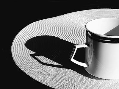
photo sharing and upload picture albums photo forums search pictures popular photos photography help login
ctfchallenge | all galleries >> The Best of CTF Challenges >> Best of 2005 > 5th: A Second Cup * by Shu
previous | next
05-MAY-2005 Shu

5th: A Second Cup * by Shu

(It's a little worn, like me, but still good.)

Canon EOS 20D
1/250s f/11.0 at 33.0mm iso200 full exif

other sizes: small medium original auto
comment | share
alexeig09-May-2005 16:09
Nice contrast here
Nugar08-May-2005 19:39
Beautiful!
Canon DSLR Challenge08-May-2005 04:31
Abstract--Thanks for giving me a hand with moving...LOL Shu
Guest 08-May-2005 01:10
This one is excellent Shu, the balance of black and white, the curves, it has that art deco look. I really like it.
ctfchallenge07-May-2005 22:19
Shu, if you want to move this image to eligible with comments..."edit image" then choose "c80_eligible" from the drop down menu under "Destination Gallery"and click "Add to gallery". You can delete the image from Exhibition afterwards. -Abstract
Shu07-May-2005 14:07
I already have three images in Eligible......if you can instruct me, I may switch this with one in Eligible, but I want to retain the important critiques under the images. Is there a way to do this? Appreciate it, Shu
Canon DSLR Challenge07-May-2005 02:47
This is great Shu! Why is it in exhibition??? theFly
Guest 06-May-2005 23:57
beautiful. not the image is very crisp and clean. i like it alot.
ctfchallenge06-May-2005 23:14
Thanks Dorys, I don't want any "sore thumbs" in this image. Shu
Guest 06-May-2005 17:14
i like this much better shu. i know this is a nitpick but you might want to clone out the black speck on the cup and the one just above the shadow on the matt.
aam1234 06-May-2005 04:27
Looks much better IMO. Well done Shu.
aam1234 05-May-2005 21:05
If you ask me, I'd crop the upper part till the edge of that round thing (don't know what is it called in English) and the left side till the other edge of that thing. The cup will not be centered if you do so. Give it a shot, and see what happens.
Rod 05-May-2005 19:33
It's just the emphasis is on the cup with everything else secondary. I found with the crop the cups shadow became more prominent & it all balanced for me:-)
Shu05-May-2005 14:01
I actually took many shots of this cup, including the1/2 cup composition, and when checking found I liked the cup as you see it. It's tricky, but when checking the mass of images, my eye immediately went to this compo. Maybe it's the mat and papers trailing that make it more interesting. (?) Thanks, Shu
aam1234 05-May-2005 13:22
Was interested on how Uncle Rod's suggestion looks like. So I covered 2/3 of the cup with a piece of paper. Honestly, I didn't like it that much, the original looks better (IMO of course).
Rod 05-May-2005 10:20
Good thinking Shu, I like the abstract of it too. I think it will look better as an abstract with the right 2/3 of the cup cropped out which gives a better balance & all the elements come together as a whole
ctfchallenge05-May-2005 01:44
I tried B&W but liked the creamyness of the bone china cup and the subtle color picked up in the paper at the far end. Overall, I see an abstract (just a bunch of shapes that make a pleasing composition). Shu
Guest 04-May-2005 22:32
I like the fact that its black and white but not black and white. :-)