I like the B+W version better. Also like the 2nd choice with the bottom cropped out. It seems to be more of a personal statement. LOL dorys
Rod
08-Jan-2005 11:22
Dorys behave yourself I'm having a crises on whether to change this for a B&W version. Wot do you think.
Rod
08-Jan-2005 05:05
Bugger, I've just posted the comment below & now I can't take me eyes off the bleeding coloured rolls.......Thanks Iso:-)hehe
Rod
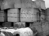
08-Jan-2005 05:03
It's strange Iso that I'm really aware of how poison the colour red is in a colour shot for distracting the eye away from the focal point, yet here it is in one of my shots:-) I'm not so sure about the distraction for me, as I find the fence & barbed wire & the heaviness of the blocks overpowers the colours in those rolls. I did get some shots of the blocks without the coloured rolls in but I didn't think they worked as well. I will post one in the DP thread & see what you reckon. I will be interested what others think about the coloured rolls being a distraction or not. I know wot Lonnit will say. Thanks for the comment Iso.
Fun capture! Purely critical here - the coloured objects lead the eye away from the message. Judging by the fence though any other shooting angle was not open to you.