photo sharing and upload picture albums photo forums search pictures popular photos photography help login
ctfchallenge | all galleries >> Challenge 70: Framing >> Challenge 70: Exhibition > * Philadelphia
previous | next
27-AUG-2004 Lonnit Rysher

* Philadelphia

Pennsylvania

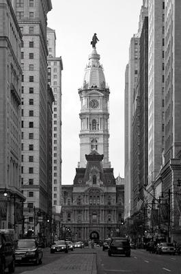
UGH! This gallery's background color is making this shot look dull. I guess it's too close to the main greys. It looks much better outside the gallery. It appears to lack contrast here. It even looks better on pure black in my personal gallery here: http://www.pbase.com/lonnit/image/37326038.


other sizes: small medium original auto
comment | share
Rod 14-Dec-2004 10:46
I agree, it looks a really good shot now..............for a dizzy dame:-)
ctfchallenge13-Dec-2004 05:13
Rod, here's the new, more contrasty image. It was tough to do it without blowing the sky, but this is an improvement. ~ Lonnit
Rod 12-Dec-2004 04:42
Yes the black background does help a bit but the shot does lack contrast. If you just look at the street, buildings & not the sky then some more contrast might be the go. Very nice shot though Lonnit.