


|
|
|
|
|
|
| |
| 27-AUG-2004 | Lonnit Rysher |
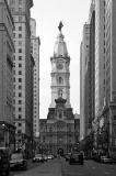
UGH! This gallery's background color is making this shot look dull. I guess it's too close to the main greys. It looks much better outside the gallery. It appears to lack contrast here. It even looks better on pure black in my personal gallery here: http://www.pbase.com/lonnit/image/37326038.
| Full EXIF Info | |
| Date/Time | 27-Aug-2004 18:56:52 |
| Make | Canon |
| Model | EOS 10D |
| Flash Used | No |
| Focal Length | 56 mm |
| Exposure Time | 1/125 sec |
| Aperture | f/4.5 |
| ISO Equivalent | 400 |
| Exposure Bias | |
| White Balance | (-1) |
| Metering Mode | partial (6) |
| JPEG Quality | (6) |
| Exposure Program | aperture priority (3) |
| Focus Distance | |
| comment | |
| Rod | 14-Dec-2004 10:46 | |
| ctfchallenge | 13-Dec-2004 05:13 | |
| Rod | 12-Dec-2004 04:42 | |