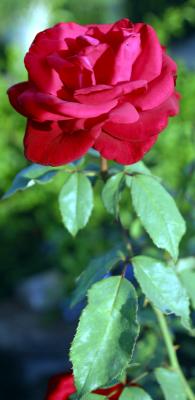
Thanks so much Nugar. I was thinking the same thing myself. Last night, I learned that you can correct color cast problems by hitting auto color and so I did this and the color is much better now. I had tried other things before with as you could see, no success. Thanks again. Susan
I like the composition. Goes well with the vertical. Although you didn't place a *, I just had to say that I personally think a bit of color balance would make it better. On my monitor, it looks a bit yellowy. Maybe drawing it to a cooler color balance would help...