Thank you for the comments :o)
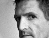
The graininess (noise) was, um, natural. My camera did it. I called it Johanne's no(i)se just for fun. Get it? Nose/Noise... ah forget it, lol.
I agree with the previous post that I don't think the nose is really all that emphasized. I'm much more drawn to his eyes, which I like greatly. The "negative space" on the left is interesting, but it could be smaller. I don't mind the cropping, but I think the photo feels a bit unbalanced. I think maybe I'd try cropping it into a square and seeing how you like the results. I like the (applied?) grainyness though. It definitely matches with his angular features and the way that he's looking at the camera (if that makes any sense at all).
cgesteland
11-Apr-2002 16:00
This shot grabbed my eye right away, yet it seems like something's missing... Hmm. The title indicates that you are trying to emphasize his nose. I don't know that that's conveyed very clearly here. The immense gray space on the left side detracts attention and though I tend to favor partial facial portraits, having the chin cut from the frame just makes it look like you should have turned your camera 90 degrees and given him a vertical frame.
He is certainly an arresting subject with eyes that skewer the viewer. Cropping the left side and maybe the mouth would be a better way to go... It's a tough one. Gee, was my wishy-washy advice a lot of help? ;)