photo sharing and upload picture albums photo forums search pictures popular photos photography help login
ctfchallenge | all galleries >> The Best of CTF Challenges >> Best of 2008 > 1st: Art amongst the garbage
by keithinmelbourne
previous | next
05/11/08 keithinmelbourne

1st: Art amongst the garbage
by keithinmelbourne

Melbourne, Australia

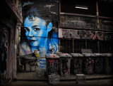
I was playing with my G10 on Wednesday, wandering around Melbourne at lunchtime.
When I came across this scene, I was struck by the the juxtaposition of the painting and the garbage bins.

Canon PowerShot G10
ISO 80, f.5, 1/80sec full exif

other sizes: small medium original auto
comment | share
Ashley Hockenberry18-Feb-2009 15:10
vote !!
ctfchallenge14-Nov-2008 23:59
This is terrific Keith! I saw the desat version and I really like this one much better - great composition and the color contrasts are really nice too. CJ
ctfchallenge12-Nov-2008 23:25
This version is stunning. No need to desaturate anything anyway as the blue stands out plenty. -COAmature
Rod 12-Nov-2008 06:31
Yes this looks a lot better & it also looks like a camera created it, well done. Just one thing catching me eye, the milk crates I've seen are normally brightly coloured did you desaturate these ones or were they greyish?
ctfchallenge12-Nov-2008 03:56
Yes!! Penny Street
ctfchallenge11-Nov-2008 21:03
I think this color version is so much better, Keith. It seemed too contrived before, not to mention somewhat static. In this version, the touches of red and rusty brown move the eye through the image and around the dominant blue face, making the image much more dynamic. And the spot of yellow right under the face--perfect.
--Mary Anne
ctfchallenge11-Nov-2008 10:19
Thanks for the criticism folks. You've convinced me that you know what talking about. So I made a quick exchange for the colour version. This is good fun by the way.
ctfchallenge11-Nov-2008 04:26
Well, I thought I liked this alot until I saw the full color version. Since the natural color still allows the "art" to be clearly the subject, I don't see the point anymore in the desat. In fact, now that I look again, this version looks bland in comparison. Of course, that's only my opinion .... Penny Street (glad to have you aboard, Keith)
ctfchallenge11-Nov-2008 03:59
Thanks for the full color version link. I find it much more natural and convincing while the partial desat is a contrivance in my humble down-to-earth eye. The color version is very well done and lets the "art" speak for itself. -tv
ctfchallenge11-Nov-2008 01:51
I like the color and the p-dsat versions... but this one has a tad bit of an edge to me.

That's why I put 'backwards' in quotation marks. *grin* I'm glad you're here. Looks like we'll have a bunch of fun together, Keith. ~Lydia
ctfchallenge11-Nov-2008 01:01
I really like this partial desat much better than the color one. This is much more subtle and much less "in your face" than the color version. ~Sharon
ctfchallenge10-Nov-2008 15:39
The color version is much better, imo.
-k2
ctfchallenge10-Nov-2008 14:18
For me the color version works too, I like it perhapst even better than this one. DaB
ctfchallenge10-Nov-2008 10:37
Thanks everyone for the comments. I was undecided about the partial desat, but found the full colour version a bit messy and distracting. The risk with shots like these is the lack of a subject. Perhaps this version was a bit too obvious. The colour version is at this address:http://broady.smugmug.com/gallery/6456102_cen5q#412788193_bK46t-A-LB
Sorry about the date confusion. WE think that the US version is backwards. Maybe it's because we're upside down :-)
ctfchallenge09-Nov-2008 18:32
Lydia you're not alone as I really like this (and partial desats are not something I usually enjoy). I still have to wonder, though, if I wouldn't like it as much either in full color or (more probably) b/w since the light is so good.
Welcome! Penny Street
ctfchallenge09-Nov-2008 16:51
Oh... now I've figured out your 'backwards' date. I thought, being an American, that it was taken May 11th... Silly me.

Sorry to alarm you... if I did. ~Lydia
ctfchallenge09-Nov-2008 15:40
I like it very much just like it is... But, I'm the rebel in the bunch here, Keith. :) It's a wonderful image, and perfect for the challenge.

It needs to be in the Exhibition gallery, though, since the Eligible gallery is only for images taken during the challenge period. We'll still vote on the Exhibition gallery... it's just a rules thing. If you need help moving it, just ask and someone will do it for you.

Welcome! I'm looking forward to more of your art. ~Lydia
Canon DSLR Challenge09-Nov-2008 15:15
enjoyed your pics at the forum- welcome to the challenge - Debi
ctfchallenge08-Nov-2008 21:59
stunningly beautiful! excellent bw processing work. one of the few occasions where i loved the partial saturation post-processing. -Abstract
ctfchallenge08-Nov-2008 14:24
Great idea, composition, and lighting, Keith. However, I have to wonder how it would look without the selective desat...either the original (more or less) color or a b & w conversion without any color at all.
--Mary Anne
ctfchallenge08-Nov-2008 10:25
The effects were all done PP, using CS3. I copied 3 layers, converted one layer to B&W, and used a mask to highlight the colour on the painting. I also multiplied the edges.
Guest 08-Nov-2008 09:48
Was this done using the G10's Colour Accent Mode, or PP? Which ever its effective
I get really annoyed when I see a nice piece of street art daubed with mindless tags.
YB
Rod 08-Nov-2008 09:00
Welcome to the challenge Keith:-) This looks like a Photoshop creation to me. How does this look as a photo?
ctfchallenge08-Nov-2008 07:41
Interesting picture. The whole scene looks like some street artists gallery. Malapropos.. You may want to check out Miroslav Tichý.
-k2
ctfchallenge08-Nov-2008 07:39
This is fantastic, Keith! I really like your processing and your vision. I don't recall seeing your name in the challenges before - welcome! You will be a wonderful addition to our little community. ~Sharon