I think I know what you mean. And I think I may have alternate explanations. In the color picture, the featured item is mainly the blackness. Most of my PP there was to bring it out as well as possible. In order for the fruit to be rendered well, I decided to go for 800 pixels wide rather than 700 pixels wide as I normally use. The smaller size just didn't capture the detail on the fruit that I wanted. A test of this idea would be to compare pbase's medium or large versions of each picture to see if they still strike you the same way.
This one is also 800 on a side, but the composition means that the fruits are smaller. That loses some of the impact of the detail on the fruit. So maybe it would be better to compare the large version of this one to the medium version of the color one to test this idea.
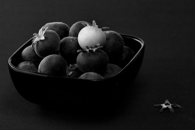
Probably more important, though, is that this picture's feature is the green fruit. The PP was designed to emphasize it primarily. I also didn't suppress the mat like I did on the other. Maybe I should rework this one a bit with that in mind. But now I'm remembering why I didn't. That calyx that fell and demanded to be part of the composition pretty much limited my ability to adjust the mat brightness. If I darken it much more than it is, that calyx would look wrong. Maybe I could adjust it with a gradient mask or something (darker on the left).
I could also try processing the green fruit separately from the black fruit, but that would short-circuit the challenge I made for myself, which was to separate them using only global adjustments. I guess it's pretty clear I think this one has room for improvement.
I certainly prefer the color version, which I think is brilliant. The darkness really sparkles there. I'm generally fond of B&W shots, and this b/w version isn't bad, but compared to the color version, this is dull - the glow is gone. I guess the dark colors in the color version are too subtle to be reproduced in a b&w picture. So.. not enough texture or life/variance in light/dark areas here to make this sparkle enough to really catch interest? My two cents - and of course a matter of taste. But even as a "stilleben" this is too still for me :P
btw.. a belated compliment: You had two outstanding (!!!) b&w pictures of dead pigeons in challenge 77.. really love those, unforgettably good. Why they didn't win is beyond me. Had to look up the challenge, but I'll never forget those two photos. The wondeful textures and variance in light there make those very vivid, perfect for B&W.
-k2
I get the impression from the comments that people prefer the color version to this one. Is that true? If so, I'd like to hear specific reasons for this, especially since I prefer this one. In a way, the two pictures work together. This one features a green fruit. I thought I'd add an interesting twist by emphasizing the green by processing it as a black and white image. The calyx at lower right, by the way, just happened to fall there. I liked it so much, though, that I made it part of the composition. My daughter Helen is responsible for arrangement of the fruit and consultation. -- Victor