


|
|
|
|
|
|
| |
| 19-SEP-2004 | Shu |
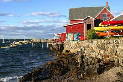
Maine,USA
| Guest | 17-Apr-2005 21:37 | |
| Guest | 17-Apr-2005 21:14 | |
| Guest | 17-Apr-2005 21:08 | |
| Canon DSLR Challenge | 17-Apr-2005 18:04 | |
| Canon DSLR Challenge | 17-Apr-2005 17:42 | |
| Canon DSLR Challenge | 17-Apr-2005 17:41 | |
| Canon DSLR Challenge | 17-Apr-2005 17:38 | |
| Canon DSLR Challenge | 17-Apr-2005 02:37 | |
| Canon DSLR Challenge | 17-Apr-2005 01:01 | |
| Canon DSLR Challenge | 17-Apr-2005 00:45 | |
| Canon DSLR Challenge | 16-Apr-2005 21:24 | |
| Canon DSLR Challenge | 16-Apr-2005 13:17 | |
| Shu | 16-Apr-2005 12:26 | |
| Guest | 16-Apr-2005 07:01 | |
| Canon DSLR Challenge | 16-Apr-2005 00:55 | |