photo sharing and upload picture albums photo forums search pictures popular photos photography help login
Canon DSLR Challenge | all galleries >> Challenge 21: Head & Shoulders (Hosted by Karthik Murugesan) >> 21 Eligible: Head & Shoulders (Hosted by Karthik Murugesan) > Head And Shoulders *
by iso3200
previous | next
4th August 2004 iso3200

Head And Shoulders *
by iso3200

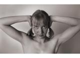
As Scotty beat me to the best ideas :p, here's another studio shot.
I've used the Sigma at the wide end to give a touch of distortion to the image, which I hope is just enough to unsettle things without being overly obvious.


other sizes: small medium original auto
share
Guest 06-Aug-2004 10:57
Karthik, I think it's pretty clear that her face has been distorted by the wide angle (which I assume has been used very close to her). I hope I'm not offending her if I say I suspect she's actually a *lot* prettier than she appears in this picture! Of course, I'm aware that the effects are deliberate, and that you *can* use wide angle for portraits if done correctly; Iso has deliberately used all the reasons why you *shouldn't* to maximum effect, IMHO.
And no, I really don't like the image, but I totally understand what he's trying to achieve. Phil
iso320006-Aug-2004 10:44
Phil is 100% correct if this were to be a traditional portrait, (which of course it isn't). I'm also pretty much aware that it's a love it or hate it type of photo and I totally appreciate both sides of the fence. It's just interesting to see who is on what side of that fence :)
Karthik Murugesan06-Aug-2004 04:44
Excellent ISO!

I disagree with PhilM on his comment " very good example of why wide angles are *not* appropriate for portraits! " I am sure this also written somewhere in every portrait photography book. But what's important is how you create soemthing appealing no matter what technique you use. I think ISO has very well succeeded in exaggerating the model's features by using a wideangle lens for close-up portrait photo and achieved an excellent result. I think he deserves more explanation Phil. Atleast I would like you to explain more on your comment, Phil. Thank you! - Karthik.
Guest 05-Aug-2004 18:35
Well, Iso, that PROVES you are a mad genius! LOL! You're one of the most talented photogs here but your goal is to create a bunch of the worst pictures possible, ON PURPOSE! LOL! Don't we already have enough bad photographers? Ok, we'll endulge you. You've got 3 months to get this out of your system but then you're only allowed one such entry per year! You will not devote your life to this and leave us hanging helplessly, breathlessly, hungering, clinging on desperately, waiting for your more standard insanity! ;) Hmmmmmm... perhaps you are just trying to throw off your immitators, leading them down a trail of doom, and when they are enrapt with perfecting this evil technique, you will dash off in the darkness only to rise again to your former glory, mesmerizing us with that which is your true perfection! AHA!!! Sounds crazy, doesn't it? DOESN'T IT!!!!!!! AHHH-ha-ha-ha-ha-ha-ha-ha..... ~ Lonnit
iso320005-Aug-2004 14:04
Lonnit that is excellent! Everything you've picked up on as a dislike I did carefully on purpose. Especially to avoid it being just another normal studio shot. Yes the wide angle makes her look spindly and breastless. The channel mixing to give the dark flesh was what I wanted and that alone made the eyes stand out. I love this one and want to do more of them!!! As long as people realise the whole thing is a planned shot and not the result of an accident them I'm well happy - disliked or liked.
Guest 05-Aug-2004 05:55
Well, well, well.... expect snow in August on the equator and flying donkeys! I cannot believe that this day has arrived - an Iso shot that I don't like? I didn't think it would be possible! LOL! Because I've got so much respect for you Iso, I will be totally honest with you - here's my list why. That unsettling wide angle is really unattractive. The pose is very unflattering to her and makes her look breastless. The face being so much darker than the body looks like a very bad makeup job, but as yetchy as that is, the super whitening of the eyes really emphasizes the too-dark face, getting into some really freaky territory here. I've got to assume that somewhere in that facinating mind of yours, there was some reason for all this! LOL! Is this one going into a chapter of a photography book you're writing, using this as an example of what not to do so one avoids making a pretty model look bad? I dang well know these weren't mistakes. I just can't figure out why you did it! LOL! :) Perhaps you were just going for the unusual as I was in my "silk print" effect! LMAO!!! Still love ya! ~ Lonnit
Canon DSLR Challenge04-Aug-2004 21:58
That *is* unsettling, and a very good example of why wide angles are *not* appropriate for portraits! PhilM
Scott Hopkins04-Aug-2004 21:45
I like it...the wide-angle approach and symmetry really do it for this shot!