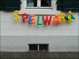
But where's the evil clown that vandalized the poor 'E'?
Seriously, it's an excellent catch, good eye Frank! It's got a sort of urban ghetto/neglect theme to it and the colors and contrast work very well for that!
Great find and nice composition - the bright colors and shapes of the sign look really good in contrast with the colorless, rectangles of the background building!
inframan
28-Jul-2007 15:53
I love this. Such a perfect balance of starkness, symmetry & whimsy.