photo sharing and upload picture albums photo forums search pictures popular photos photography help login
Sony Forums Challenges | all galleries >> Challenge 47 Advertisement (hosted by Willem) >> Challenge 47 : Eligible gallery > Architects Plus
by MFC
previous | next
25-JUL-2003 MFC

Architects Plus
by MFC

(revised photo)

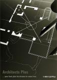
Dial 1-800-Call-Plus to make your dreams come true.
We'll send you our free, colorful booklet... it outlines our design philosophy,
provides pictorials of our work, and lists our clients and awards.
____

Converted to B&W, reverse gradient applied, then toned.
A single desk lamp for lighting...low...and from the side.

Sony DSC-F707
1/2s f/4.0 at 9.7mm iso100 hide exif
Full EXIF Info
Date/Time25-Jul-2003 21:06:00
MakeSony
ModelCybershot
Flash UsedNo
Focal Length9.7 mm
Exposure Time1/2 sec
Aperturef/4
ISO Equivalent100
Exposure Bias
White Balance
Metering Modematrix (5)
JPEG Quality (6)
Exposure Programaperture priority (3)
Focus Distance

other sizes: small medium original auto
comment | share
Sony Forums Challenges30-Jul-2003 02:25
Very effective ad and image Mike. Melanie (mlynn)
Sony Forums Challenges29-Jul-2003 01:21
I like the concept and the execution. You are a photographer (and photoshopper) for all seasons. JoeSchmoe
Guest 28-Jul-2003 21:20
Very interesting idea.
Sony Forums Challenges28-Jul-2003 01:29
Mike: This is particularly pleasing. The unusual texture you have imparted is very effective within the context of the image. Fremiet
Sony Forums Challenges27-Jul-2003 04:15
Mark, I think it's good to leave the comments...it helps show why/how changes were made; and it simply shows another point of view. Two people don't always agree about all aspects of a photo; but your observation about my "tag line" made me take another look & re-evaluate... I changed it to go along better with this photo. Thanks. MFC
Sony Forums Challenges26-Jul-2003 20:33
Yes, MFC. This new "tag line" does not take one down the path the other line did. I really like it. Would you like me to erase my long comments now that you've changed your message? Or you can erase it yourself if you are ok with that?Mark J
Sony Forums Challenges26-Jul-2003 20:07
Mark, I tried other photos with more hand...and within the context of a larger scene. I didn't like them as well. I wanted to emphasize the professional, modern aspect of the plan itself so the gradient/toned effect was used....I thought it made the plan itself "pop" and "feel different" than the usual plan...implying that "Architects Plus" had a different vision/dream than the rest... with all the "tools", high-tech and otherwise, to make "your unique dream" come true. The small section of my finger-tips/compass was used to introduce the human element/aspect into it... to "personalize" the actual science/technology/expertise involved that set this fictitious firm apart. At the time, I also thought the gradient effect/lighting implied "working into the late hours"; so I used the catch phrase "working day and night to make your dreams come true"... I can see that my "catch phrase" probably should not reflect that incidental observation since the gradient effect really wasn't used/meant to demonstrate that at all. I don't really want to change the composition or the gradient effect of the photo; so I'm going to try a different "catch phrase" (and phone number addition)... because of your observations. I think it will go along much better with this particular photo & effect. What do you think of the change? Thanks. MFC
Sony Forums Challenges26-Jul-2003 17:31
Nice work Mike. You've submitted several images with inverted gradient maps and this one is no less effective than the others I've seen from you. However, since you advertised the fact that your firm works day and night to complete it's jobs (suggesting working overtime to get the job done) I would have much preferred seeing this one in natural color, with the room lights dimmed, with a desk lamp over the job and a hand in the image actually in the midst of work. This would solidify the working day or night for our clients thing, I think. Mark J
Sony Forums Challenges26-Jul-2003 17:26
Mike, I can really see this as promotional material for some high-end architectural firm. The way you angled the blueprint, the lines of the section you chose to use, and the compass you added are perfect. The details you snuck in there are cool-- I especially like that little motion blur coming off the tips of the compass. So subtle, but adds to the overall. Good job on font selection, too. --Nancy
Sony Forums Challenges26-Jul-2003 10:06
The reverse gradient gives a very professional, high tech feel to it. Willem