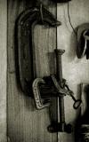
I opposite to Rob, I remember what I said on previous version, and I have to admit that this one is the best. Since in this project we are trying to imitate the shapes of letters, I think, as closer we get as better the goal reached. Sure, artistic, aesthetic and technical quality has a great importance as well. Your letter "G" has perfect shape, rotation helped!, noisy stile remind old picture, vertical lines support composition well, together with other elements of environment.
Successful work, Sue.