I agree, Kal. Just remember that black absorbs light, while white reflects it. That will help you think about how to draw your viewers into an image instead of pushing them away from it.
I am happier with this version phil. It is also similar to yur point herehttp://www.pbase.com/shangheye/image/47488185, the bright section detracted from the image, and as you say draws the eye away from the subject.
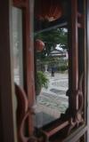
I could not even see two reflections in the original, Kal. I only saw this reflection in the window, plus what appeared to be a small over-exposed strip of "reality" along the right hand edge. So your original concept apparently did not work. By cropping out the reality, you now have a simple reflection. It is not your original idea, but it is a lot less confusing. What do you think?
That was the intent of the title! Two reflections Phil. I did try to reduce the contrast in the area to the right before posting but it did not work. I will try the crop, which though I thought about, I did not do because I felt it would remove the connection between reality and fantasy. I will post it this evening.
Crop the right hand edge and see how you like it, Kal. The change in tone between the reflected area and the actual area is jarring. Why not go with just the reflection, which is expressive because of the abstracted figure walking away from us -- he, too, is reflecting.