


|
|
|
|
|
|
| |
| 16-SEP-2008 | |
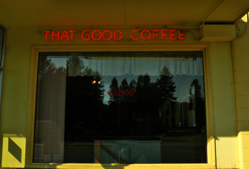
The restaurant signage in the previous image was complex and almost illegible. The restaurant signage in this image is simple and easy to read. And so I organized this image accordingly, building its coherence around two primary colors, red and yellow. The restaurant serves not just any coffee -- it prides itself on serving “THAT GOOD coffee.”
By symbolically summing up their prize product so simply, the restaurant makes it easy for their customers to grasp. And I make this image just as simple.
Image Copyright © held by Phil Douglis, The Douglis Visual Workshops