17-Jul-2019
The Sculpture Garden, Boscobel Mansion, Garrison, New York, 2019
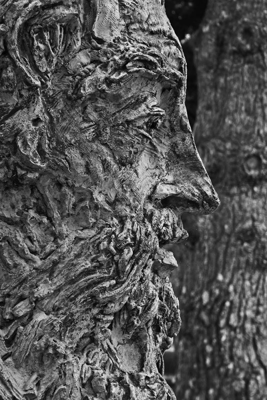
This bronze of bust of painter Thomas Moran, sculpted by Greg Wyatt, is one of ten significant Hudson River School 19th century painters honored in Boscobel Mansions Sculpture Garden. The bust has already acquired a green patina, which made a poor subject for an expressive photograph.
I simply converted my color image to black and white. The green patina vanished, replaced by the powerful presence of Wyatt's sculpting itself. The image also becomes a contrast of textures, bust vs. tree. And since Moran was one of our greatest landscape painters, that pairing of the textures becomes even more appropriate. Texture is at the heart of a painters work, and trees are essential players in many, if not most, landscape paintings.
16-Jul-2019
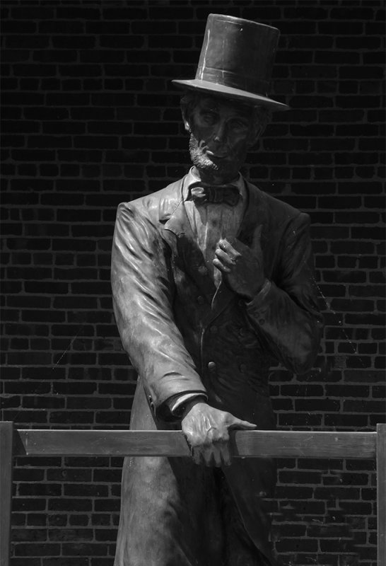
Lincoln at Peekskill, Peekskill, New York, 2019
A train carrying Abraham Lincoln to his inaugural in 1861 stopped briefly at the Peekskill train station. Lincoln emerged, said a few words, and rumbled off into history. That moment is still remembered in Peekskill, a town on the Hudson River north of New York City. The depot where Lincoln's train stopped still stands. It is now a museum. A life sized statue, recently cast and realistically painted in color, stands at its front door. I chose to photograph it at high noon, when the light was extremely contrasty, and Lincoln himself recedes into the shadows. It still did not work -- the color paint on the statue, intended to make it seem more realistic, had the opposite effect in my photograph. Lincoln looked too much like a statue and too little like a man.
By converting the image to black and white, I abstract the photograph and make it less real as a statue but seem more real as a man. My imagination now takes me back to 1861 and Lincoln stops talking for a moment to simply look at us, his face only suggested rather than revealed.
11-SEP-2016
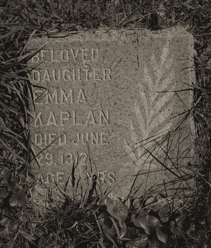
Emma, by Tom Douglis, Chicago, Illinois, 2016
My son, Tom, sent this image to me while researching our family history as part of a genealogy project. He found this grave marker among the weeds of a Chicago cemetery and photographed it with his iPhone 6 camera. He made this picture in color to document the burial place of my Grandmother’s sister, Emma, who died in 1912 at the age of 15.
While not originally intended as a work of photographic expression, my son’s photo of my Great Aunt’s grave marker becomes a powerfully expressive image once I crop it, move in on the detail, and convert it from vibrant color to this soft, sepia toned monochromatic image. The pinkish marble stone and the vivid green weeds recede, simplifying the photograph. The sepia speaks of age, while the detail on the stone takes over – a branch inscribed by man upon the stone leaps forward to symbolically bond with the weeds, a work of nature.
The image now tells the story of a young life cut short, yet still remembered as very much a part of the natural world.
25-APR-2016
Grooming the park, Scottsdale, Arizona, 2016
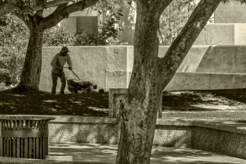
While accompanying a tutorial student during a shoot on the mall of the Scottsdale Civic Center, I noticed a series of walls enclosing a stretch of grass that was in the process of bring groomed. I organized this image before the man pushing the lawn mower even entered the scene. I moved behind the tree in the foreground to create part of a double anchor for my image, using the trash receptacle to its left as well. Just behind the tree, a low wall borders the grass. The massive terraced wall in the background repeats its shape. Another tree, in the upper left hand corner of the frame, echoes the diagonal reach of the tree in the foreground. As the mower-man moved into the picture, he falls into the shadow cast by that tree. He also leans forward as he pushes the mower before him. His head exactly matches the height of the large wall behind him, creating a perfect backdrop for his partially silhouetted figure. In the original scene, the building rising out of the hedges behind the second wall is painted blue, orange, and bright yellow. The foliage around it is a brilliant green. These colors are so attractive that they would pull our eyes to them, rather than to the man pushing the lawn mower. I solve this problem by converting the entire image to black and white. The competing colors vanish, and I add a slight sepia tone to convey a timeless mood.
28-DEC-2013
Art and Nature, Desert Botanical Garden, Phoenix, Arizona, 2013
Famed glass sculptor Dale Chihuly created these gracefully sinuous leaves, and displays them adjacent to a stand of saguaro cacti. This example of art imitating nature is but one of the many Chihuly glass works placed on exhibit throughout the vast Botanical Garden. I did not have my regular camera with me that day, so I used my iPhone camera to make this image. I later converted the image to black and white to abstract the scene, making it seem more magical and less real. The light playing on the glass leaves creates a mystical glow, a counterpoint to the shadowy and spiny live saguaros in the background. By contrasting the differing textures and forms, I blend art with nature -- the very purpose of the Chihuly exhibition itself.
03-NOV-2014
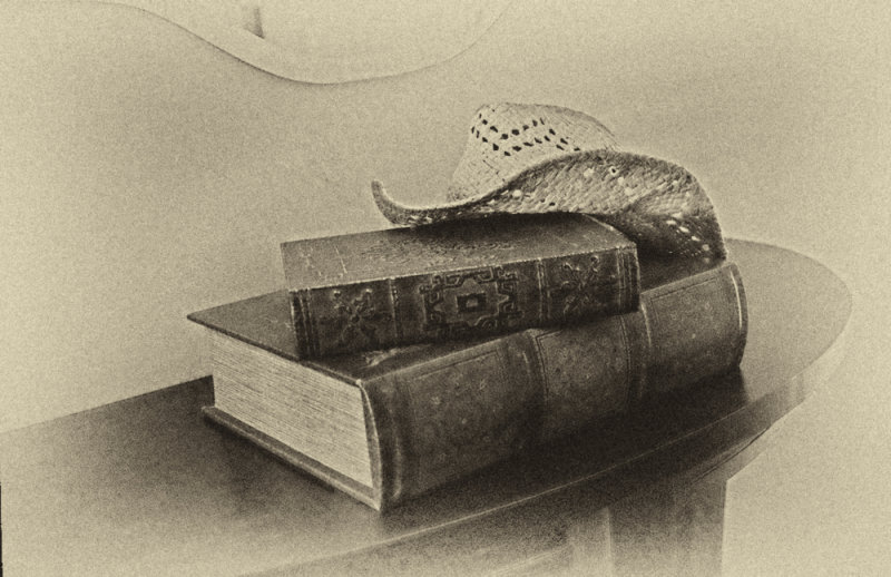
Yesteryear, Gold Canyon, Arizona, 2014
Monochromatic images can often speak of another time, and in this case, another place as well. I found a western straw hat resting on couple of vintage books stacked upon a curving table, just below a curving mirror. The table and mirror echo the curves in the hat. To make the image say more, I converted this photograph by post processing it in black and white, as well as slightly aging it by using a yellowish tone, and finally forcing the edges of the frame to gradually fade into oblivion. I use such effects in post processing for a specific purpose here – I simply wanted the image to speak of another time, and an “old west setting.” I think it does.
03-NOV-2014
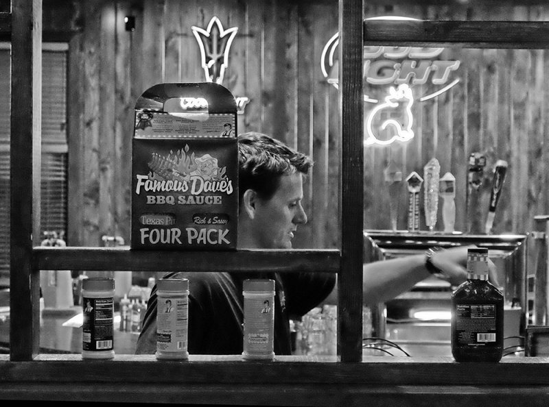
Four Pack, Chandler, Arizona, 2014
I framed this bartender at a local barbeque restaurant through still another frame, provided by an interior window. That window displays the restaurant’s barbeque sauces, along with a poster advertising them, and provides a more dimensional “picture within a picture.” The softly focused back wall, featuring neon advertisements and beer dispensers, intensifies the feeling of depth. The only problem I faced was distracting color, caused by the bizarre blue and purple lighting in the bar area. By converting this image to black and white, I was able to remove these colors and allow my viewers to see the bartender and his unique environment without distraction.
15-FEB-2013
Repetition, Oakland Cemetery, Atlanta, Georgia, 2013
I was drawn to this Victorian tomb by the golden light that fell upon it, and by the deep blue sky in the background. I also noticed that the trees in the background virtually repeated the arm gesture of the sculpted figure that dominates the image. The photograph acquires even more power when the lovely golden tones and rich blue sky are converted to black and white. The colors no longer can call attention to themselves, and the relationship of the gesture and the trees takes center stage instead.
08-FEB-2013
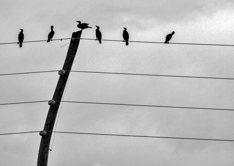
Cormorants, Tamiami Trail, Florida, 2013
The Tamiami Trail (US Route 41) runs from Miami to Tampa. It slices through the Everglades National Park, and continues through the enormous swamp known as the Big Cypress National Preserve. When I made this photograph, the skies along the Tamiami were gray, and a light rain was falling. Five cormorants sit upon this utility wire, while a sixth perches atop a utility pole that completes the illusion of notes written upon a sheet of music. The silhouetted birds, wires, and pole, along with the gray skies, provided an utterly black and white image to begin with.
13-FEB-2013
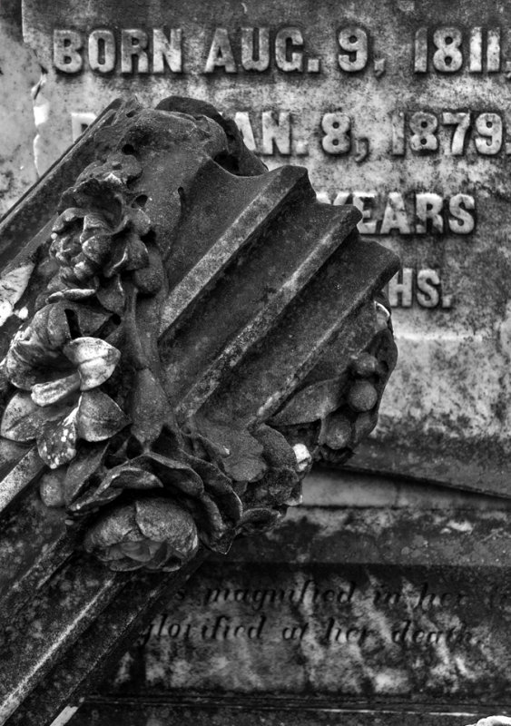
Fallen column, Rose Hill Cemetery, Macon, Georgia, 2013
A blackened marble column forms the basis of this image – it had fallen off of a tomb, and landed in front of the words defining the scope of a life. There was little color in this image to begin with – only a touch of greenish moss. By converting it to black and white, the image becomes more symbolic and less real. The moss vanishes -- the emphasis changes to the repeating diagonal grooves in the column that abstract the scene and draw the eye into the image.
13-FEB-2013
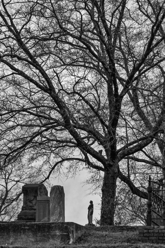
Barren tree, Rose Hill Cemetery, Macon, Georgia, 2013
This huge barren tree probably dates back to the founding of this cemetery in 1840. By photographing it from a distance, I am able to stress its age though its size, comparing it to a life sized sculpture, as well as three large gravestones standing at its base. It was raining as I made this image -- the only color was in the grass. By changing the photograph to black and white, that color vanishes, leaving the incongruous scale difference to tell the story without distraction.
12-FEB-2013
Georgia Monument, Andersonville National Cemetery, Andersonville, Georgia, 2013
The Georgia Monument in Andersonville National Cemetery, sculpted by William J. Thompson, honors all American prisoners of war. Its location at Andersonville is particularly valid – it was here in 1864 and 1865 that 45,000 Union soldiers were imprisoned by the Confederacy during the American Civil War. Nearly 30 per cent of them died from disease, malnutrition, and exposure. It is appropriate to express the grim nature of this place, and the emotional intensity of this sculpture, in the black and white medium.