I agree, I wouldn't change your entry. I put a perspective corrected version side by side and thought this one had more "energy". It also lets you see more of the terrificly worn wall.
This is a shot I'd print and hang on the wall. In that regard, hung at eye level, a perspective "corrected" version would be worth a look.
Were this mine, I'd probably print it both ways and try it.
Bob
Bob,
Thanks for the kind words.
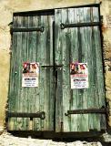
I'll have a go at perspective correction sometime, but I thought the crooked angles actually helped this image look more aged and "authentic".
Mike.
cbses
19-Aug-2005 00:33
Mike, this is kind of subject that really appeals to me. Old, worn, great textures - what stories these doors could tell.
I'm not suggesting that you alter this for the comp, but one fun thing to try on this would be a perspective adjustment to square everything up. I don't know that it'd necessarily be an improvement, but it provides another look.
Nice capture -
Bob