Mike, ROT is what also jumped out at me. This doesn't have to be symmetrical horizontally or vertically and I'm sure you could find a way to place that button closer to the upper or lower left or right ROT focus point, ie a third of the way in from the edge.
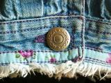
I like the textures and colours. The lighting from teh right also helps to define the textures and folds. My wife just walked past and commented that this is a nice photo and I have to agree. Well spotted.
John
cbses
30-Jun-2005 01:52
A very interesting shot. It doesn't scream BLUE, but there's enough of a stonewashed blue whisper here to keep it on theme. When I first saw it, I thought 'rule of thirds' -move the button. Gave it a try myself and decided your placement was best...the edge of the cuff pulls enough attention to the right (for me) to make it work. Plenty of texture, and enough contrast to keep it interesting.
Bob