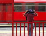
Thank you so much for the suggestions. I have gone back to the original and given it a tighter cropping. The thirds have still been maintained and the focal point is better. This is why I enjoy coming here. JeffryZ
Hi Jeffry, I think Ord is on to something, a crop would certainly improve your image. I would crop away the top, right the way down to the top of the train, this would take away the distracting fence and leaves, give the picture more impact and also help it to fit the theme even better than it already does.
I thought coming lower threw the proportions off. Right now the strong lines are at or close to the 3rds and cropping more off the top would make it look squeezed. Unless you cut off more all around where you would start cutting off the arm and feet a bit. Just my thoughts. JeffryZ. Others?
Guest
02-Jun-2005 22:35
I like the way you have four red elements here - the shelter, train, shirt and tiles. I find that the little bit of space above the top of the shelter and the leaves hanging down detract a little - I wonder if a different crop might look even better.