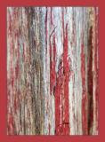
I do agree with you. The frame is disturbing on this picture. I should have changed it.
Thanks for the feedback.
Marc for AF.
cbses
05-Jun-2005 00:39
A simple shot with interesting detail. Very effective. Although I truly like the photo, there is something about the frame that I really don't like - maybe too smooth, modern and plastic looking for the subject.
Guest
02-Jun-2005 22:26
I like the way the dof works to draw the attention to the more red area - even without too much painted area, the red color clearly dominates the shot.
Thanks John for this extended feedback. I agree that there must be alternatives to make the composition more attractive. Actually there are many many more...
Marc for AF.
Guest
30-May-2005 12:02
G'day Marc - got you right this time. :^) The thing I like most about your two red painted wood entries is not so much what each one does in its own right, but how they complement each other, with this one angled front to back with use of DOF to show off and highlight the peeling '3D' paint vs the other one in the camera's focal plane just like the wood's flat paint but rotated to change the perspective. The same tonings tie the images together very well.
Of the two, I favour this one as it's more interesting for me to look at. I like your choice of composition to have the paint fuller from the bottom of the frame to thin out a lot in the top third of the frame. As some food for thought, I might have tried the focus range to be slightly further back to be more centred on the peeling paint. I might also have positioned that paint 1/3 in from the left or right border to see whether that ROT positioning would be any better or worse. Another idea would be to position the peeling paint that way and have the region from there to 1/3 from the opposite border in focus to cover the space between the left and right ROT vertical lines to provide some symmetry while still having the paint at the right or left ROT position. In any case, your choice of angle is great to allow the peeling paint to provide more depth and shape in your image.
Cheers, John