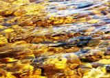
I like how you titled this, very appropriate. Maybe a little strong on the saturation; there's nothing there to really balance out the very warm color of the stones, except that little bit of reflection near the top.
The difference in looking at the thumbnail and the full image is interesting. I actually think I like the thumbnail better since the large-scale shapes are the real draw for me in the image. I know that PP is supposed to be restricted for this, but I'm curious how this would look with a Smart Blur in Photoshop.