I think this confronts the theme directly, and provides an alternative to bucolic scenes presented by many others. It's kind of edgy and forboding. It gets me thinking.
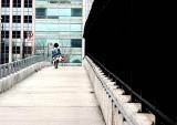
I like the composition and color palette. As mentioned previously the near solid black on the right tends to overwhelm the picture (at least in my old uncalibrated monitor!) Personally, I would be tempted to crop a little of the black and try to bring in a little detail from the railings.
Regards,
Richard.
I wanted the fence to the right to give it a "heavy/dark" look.... imposing vs the airy left.... the fence is actually part of the "Border" between Canada, to the right is customs for the tunnel..... if anyone has come through the tunnel to the states, just as you emerge into the daylight, look to the right & there it is.... Iam3D
Guest
11-Mar-2004 08:56
Good sense of direction. Fits the "alone" as well. The right side is too heavy, may be the problem is the lack of detail there. May be some recropping will help. Any postpocessing? It looks to me that some washed-out areas exist. The overall impression is very good. May be just that black fence...
Alone theme is alive and well here. The black on the right is quite prominent however, don't you think? Good leading lines to draw the eye to the subject.
Jim Rickards