


|
|
|
|
|
|
| |
| 06-MAR-2004 | - |
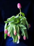
Forgot to give the flowers water last night, just one alone still fresh.
Changed the background 9/3-04
| comment | |
| niamh | 12-Mar-2004 23:35 | |
| Guest | 11-Mar-2004 09:07 | |
| Luminus | 11-Mar-2004 07:56 | |
| Konica Minolta Users | 10-Mar-2004 13:17 | |
| Per | 09-Mar-2004 15:33 | |
| Guest | 09-Mar-2004 10:26 | |
| Claudio Gatti | 07-Mar-2004 16:12 | |