photo sharing and upload picture albums photo forums search pictures popular photos photography help login
Mark Krauss | all galleries >> Photo of the Day >> pad_2009 > 2009-03-16
previous | next
16-MAR-2009 Mark A. Krauss

2009-03-16

A B&W version of this is at http://www.pbase.com/mkrauss/image/110304215
~
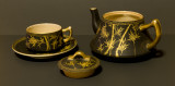
In the early 1950's, my father-in-law, Steve Bell, Warrant Officer, USMC (now deceased) served in the Korean Conflict.
On his return, he brought with him the Tea Service shown above. It could be Japanese or Korean in origin, we really don't know.
It is simple and something my wife cherishes.
Our daughter challenged me to shoot it for today's PaD with the caveat that I could not use a light tent, flash, strobes, or studio lights.
The setting was the dining room table with the overhead light on and two sheets of "black" (grey) construction paper.


other sizes: small medium large original auto
comment | share
Steve Thuman29-Mar-2009 01:34
Tough choice between this and B&W. I think I'll go for this one, but could just have well gone for the B&W
Dirck Brinckerhoff20-Mar-2009 05:03
I like this one more, for it's warmth and clearer rendition of detail.
Guest 18-Mar-2009 16:04
Looks good Mark! I personally prefer the color(this one) version.
Bea.18-Mar-2009 03:43
I prefer this one and the lovely softness of the gold.
Ruth Voorhis18-Mar-2009 01:39
I like both versions, but prefer this one for its lovely, subtle colors.
Ruth
Ed Duverger17-Mar-2009 16:56
Mark,a profesionnal job.Your daughter should give you 9/10 points.
v c bacon17-Mar-2009 15:15
I prefer the color version, Mark. It seems to have more shadow detail.
Guest 17-Mar-2009 11:29
I think you did a great job with the lighting challenge , Mark. Surprise, surprise, i actually prefer the black and white one, as it really highlights the design
Jack Hoying17-Mar-2009 11:13
This is my favorite of the two. I think the B&W version needs to be on a lighter background to make the subject stand out.
Guest 17-Mar-2009 06:29
I like both, but I think the color one I like most. You can see the beauty of these pieces better with the color.
Paul Milholland17-Mar-2009 04:36
Kasi's a tough taskmaster, but you came through. . . .
Pam Haley - FrogHouse Photo17-Mar-2009 04:23
As someone who loves tea sets this one is a real beauty. I prefer the ambient lighting over the B&W as the color helps to show off the and contours of the individual pieces. The little glint of light at the heart (top) of the tea pot draws me right in.
This tea set is a real treasure.
fotabug17-Mar-2009 04:19
Gorgeous, but I like the B&W best
Guest 17-Mar-2009 04:00
Beautifully done Mark