did you try HSL and just work with the yellow and use the slider to get some red out of it?
Looks like it's a beautiful tree.
Guest
10-Nov-2007 10:57
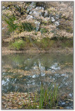
The leaves certainly looks dry, but I agree with the others, this photo could use some more contrast.
cogerox
09-Nov-2007 18:06
Yeah, doesn't that just bite when you can't find the shot. Actually, you were right on it. I might have included even more foreground in front of the rushes to give them some 'space'. Can't comment on the colors now, because I'm on a really lousy monitor, but it appears this could use some more contrast or, at least, deeper shadows.
Thanks for people's comments. There are several things that I struggled with for this photo. First, with the severe drought, the leaves on this tree simply dried up instead of changing colors in the fall. The leaves ended up a weird silvery pink color. When the sun hit it, the effect was startling. However, when I worked on the image in PS. The scene just looks weird, not interesting. I warmed up the colors quite a bit just so it appeared more "real"!
As for the composition. I tried the scene both with and without the rushes. Without created a very symmetrical balance that just didn't seem to work. I'm sure there was a terrific photo opportunity here but I just didn't figure it out! Cheers,
LG
Guest
09-Nov-2007 13:49
Interesting discussion. The contrast button can also do wonders. I love the scene however. V
Guest
09-Nov-2007 13:25
I agree...While I like the overall composition, there just seems to be a lot going on. The reeds and the leaves at the bottom dont really do to much for me. Its an great photo overall, but I wonder what it would look like If it were cropped a little differently.
tnun (dpc)
09-Nov-2007 06:07
You've made the tree to look as if it were in blossom. Almost. Again, a nice light touch with colours. While I like the reeds and pooled leaves at the bottom they distract me from the main feature. Distract, not detract, because the whole is pleasing, but I really like the tree and the way the first drift of leaves appear to reflect it.