


|
|
|
|
|
|
| |
| September, 2004 | Paul Fink |
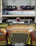
Paul wanted to submit this composite of two contrasting shots he took at a British Classic Car Show last summer. Top is a rear view of a largely unfinished vehicle; bottom is a front view of a highly finished and polished body.
| comment | |
| kodak_challenge | 23-Jan-2005 19:24 | |
| kodak_challenge | 23-Jan-2005 05:26 | |