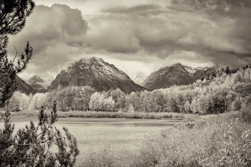
Some scenes are classics and just made for B&W. In my continuing experiments in color to B&W conversion I chose this one to illustrate a classic landscape scenic. Maybe some, like this one, are classics because we've been influenced by the work of Ansel Adams and others. Whatever.
I've really gotten into B&W - even to buying Ansel's "The Negative" and a book on the zone system. There's lot to learn and apply even though I shoot digital and don't work in a wet darkroom. One thing that intrigued me was the zone system's technique of "placing" a certain area in a specific zone - such as placing the most important shadow area and/or the most important highlight area. In the case of today's PAD, I judged that the most important shadows (those where I wanted to ensure that detail was present) were at the base of the center mountain just above the mid-ground trees. These shadows are smack in the middle of zone III just as Ansel preached. Lots of fun.
The IR appearance of some trees is because they were *yellow* aspen (in their fall colors).