


|
|
|
|
|
|
| |
| 15-JUN-2008 | vincentnyc |
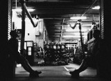
Tough work / gritty image.
Please respect each other's work - do not delete, move or edit entries - thank you!
| comment | |
| Katherine Stanback's Photos | 23-Jun-2008 23:48 | |
| Justin Miller | 23-Jun-2008 20:58 | |
| Bruce T Jones | 18-Jun-2008 17:28 | |
| Sony Forums Challenges | 17-Jun-2008 14:05 | |
| Guest | 17-Jun-2008 07:01 | |
| jrdu | 17-Jun-2008 06:53 | |
| Guest | 17-Jun-2008 05:39 | |
| inframan | 17-Jun-2008 05:26 | |
| jrdu | 17-Jun-2008 05:10 | |
| Guest | 16-Jun-2008 15:43 | |
| John Dunn | 16-Jun-2008 11:50 | |
| Ray Johnson | 16-Jun-2008 04:26 | |