Thanks for all comments...
Maby it will be good to fit better contrast but in this case nobody send me comments :-)
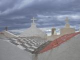
The through is that, this title looks really poor ... maby "IN THE DARK..." will be better... any suggestion..?
P.S. if you see that the camera was not too good, so quality is the same....
Wow, I like this one a lot. Not that I play them very often, but it reminds me of a computer generated environment in a video game. A first person 3D game, and you're running around on roof tops shooting bad guys. Cool :)
This is a really interesting shot, but I'd also like to see the contrast increased a bit, but not as much as CJ did. I like the softness of the clouds as they are here, but I'd like to see the buildings stand out more.
--Mary Anne
looks like some kind of surreal chess board for the heavens. several different patterns here, too.
Personally I'd opt for CJ's idea for boosting the contrast and USM for more drama - though maybe then it wouldn't fit the title as well. I think the USM in CJ's example is slightly too high if you look at the artifacts around the crosses - but then again maybe they're just JPEG artifacts in the original (I took a quick stab at it myself but results about the same - but I'm sure if starting from full size original it could be done) - b.c.
LOL! Now, my comment is that I'd like to see the contrast increased and a little USM applied to darken the clouds and make the crosses and building stand out more - like this!
http://www.pbase.com/cj_in_ca/image/66852473 I may have overdone it though! You can remove this comment and link whenever you like A.Jarosz. CJ
Wow! Great colors. I really like the low contrast in this. It adds nicely to the mood. I wouldn't have been able to stop myself from really upping the contrast! Glad you did! -Christina