photo sharing and upload picture albums photo forums search pictures popular photos photography help login
Type your message and click Add Comment
It is best to login or register first but you may post as a guest.
Enter an optional name and contact email address. Name
Name Email
help private comment
Phil Douglis | all galleries >> Galleries >> Gallery Thirty-Five: How style and interpretation combine as expression > In motion, Haynes, Arizona, 2006
previous | next
20-MAY-2006

In motion, Haynes, Arizona, 2006

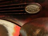
Another element of my photographic style is a desire to create a sense of movement within a still image. Although my subject is the rusted shell of a car that may never move again, I am able to imply movement by composing this image around a Ford logo that appears to be streaking across the top of the picture. Its oval shape leaves a trail of aerodynamic bars behind it. Many photographers stylistically prefer to use the abstracting power of black and white, but I usually work in color, because I feel that it brings a dimension of reality to travel imagery. I anchor my style around the dynamics of color itself. In this case the splash of red paint energizes the lower half of the image, while the oval logo speeds across the top half. The red paint links the curving line leading into the image from the left, with the curve of a fender at lower right. It stands out in sharp contrast to the rusty metal that fills much of the frame. If I had used black and white to interpret this subject, the image would not express as much motion.

Panasonic Lumix DMC-FZ30
1/500s f/7.1 at 7.4mm iso80 full exif

other sizes: small medium large original auto
share
Phil Douglis25-May-2006 22:38
Thanks, Celia, for commenting on the expressive role of both color and rust here. I will always think of your linkage between rust and the wrinkles we get as we age. My favorite photographer Henri Cartier Bresson once said that "Wrinkles are a mark of life. After a while everyone gets the face they deserve." I guess this old Ford earned its rusty patina through years of hard driving. In those days, people did not lease cars or trade them in for the latest models every few years. This Ford served its owners well, and I thought it appropriate to interpret it as still on the move, even though its engine may be long gone. The red and the rust, its graceful curves and implied energy, are all that remain of it, and I've tried to make the most of them.
Cecilia Lim25-May-2006 22:01
This is a wonderful, abstracted portrait of a car - you've captured the very essence of the car by just showing its beautiful curves and the energy that is implied with its thrusting lines and colour. I agree with you completely about how important colour is in travel photography - it not only brings a dimension of reality, but it is another great tool for creating emotion in an image - the red in this image implies power and desire. And as I can imagine, these Ford cars, must have been coveted by all when it first made its appearence back in those days!

I too, like you, find the colour of rust beautiful. I love how you poetically describe it as "nature working away at the creations of man". The rust here not only adds to the visual interest of the image, but it is a representation of time gone by, like wrinkles on a human skin, adding depth and character to the car.
Phil Douglis24-May-2006 22:11
Well summed up, Jenene. You add an additional incongruous dimension to this image for us. Thank you.
JSWaters24-May-2006 21:58
Comets and streaking emblems to signify her onetime speed, but that rusty patina is a testimony to a well traveled life.
Phil Douglis24-May-2006 18:51
Yes, it is a comet. I am sure Ford's designers were thinking of comets and speed when they designed this part of the car so many years ago. And yes, things see to move faster going from left to right, perhaps because its going with the natural flow of things. When we scan the horizon, we usually scan from left to right as well.
Kal Khogali24-May-2006 14:16
Yes...a commet, that's what I thought. I wonder why it looks better going left to right...perhaps because of the way we read? Anyway, beautiful image. K
Phil Douglis24-May-2006 00:16
Thanks, Mikel -- the texture of rust is always tactile and quite symbolic. I find the muted color of rust quite beautiful. It is nature working away at the creations of man. As I said, the dynamics of color play a bit part in my photographic style. This image is a good example of how I like to use color to interpret the subject.
Guest 23-May-2006 23:31
In fact, that Ford sign looks to my like a commet crossing the sky, a rusty one though. ;)
The abstraction is a good point here, no need to say that for anyone who knows car brands knows that tis is a car and thanks to the rusty metal and the forms as well as the Ford emblem we can make our selfs an idea of what kind of car it is. It's scratches and rusted textures also tels us the state but I think it adds a very interesting astetic value to it too.
Type your message and click Add Comment
It is best to login or register first but you may post as a guest.
Enter an optional name and contact email address. Name
Name Email
help private comment