


|
|
|
|
|
|
| |
| 07-JAN-2004 | Rajesh Gupta (Karma_raj ) |
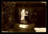
The Traveler
Please respect each other's work - do not delete, move or edit entries - thank you!
| comment | |
| Katherine Stanback's Photos | 20-Sep-2005 23:42 | |
| Sony Forums Challenges | 20-Sep-2005 20:47 | |
| Rajesh Gupta (Karma_raj ) | 20-Sep-2005 01:48 | |
| roberta | 20-Sep-2005 00:40 | |
| Rajesh Gupta (Karma_raj ) | 18-Sep-2005 05:44 | |
| Marcus | 18-Sep-2005 04:18 | |
| roberta | 17-Sep-2005 04:23 | |
| Guest | 16-Sep-2005 05:44 | |
| Guest | 15-Sep-2005 22:28 | |