photo sharing and upload picture albums photo forums search pictures popular photos photography help login
Type your message and click Add Comment
It is best to login or register first but you may post as a guest.
Enter an optional name and contact email address. Name
Name Email
help private comment
Phil Douglis | all galleries >> Galleries >> Gallery Nine: Composition -- putting it together > Façade, Fonseca College, Santiago de Compostela, Spain, 2004
previous | next
02-SEP-2004

Façade, Fonseca College, Santiago de Compostela, Spain, 2004

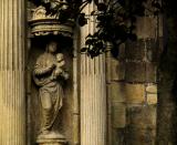
This structure, the original building of Fonseca College, dates back to the 16th century. It is used today to house the University's library. My point in making this picture was to express its extreme age, and by implication, its value to the community. After 500 years, this religious statue and its surrounding columns – a study in weathered texture -- still stand alongside of a busy street. The soft light and worn texture speak volumes about age, yet this image is still basically flat, without much depth perspective or dimensionality. To add such perspective, I first shifted the statue from the middle of frame to the left hand side, so that it looks into the picture. Off center subject placement usually adds a bit of tension and appears less static and predictable, but it did not solve this flat perspective issue. Then I realized that the shadow under the canopy over the statue seems to make it emerge from the past, and peer out on the present and future. But we still have an essentially a flat image. So I stepped back further to bring a low hanging tree branch into the frame, moving the camera so that the branch seems to reach out the statue, as if to grasp it. We now must look through these branches into the picture, which most definitely implies depth, and adds a sense of perspective to a picture that had very little before I included that branch in the frame. This bit of depth perspective, coupled with the mellow color, soft light, worn textures and the canopy shadows, carries us back into time – and that is how I made this image speak. Do you agree or disagree with my approach here? Please leave your comments, questions, and criticisms. I will respond, and our dialogue can help everyone who comes here can then learn more about expressing ideas photographically.

Canon PowerShot G5
1/400s f/4.0 at 17.6mm full exif

other sizes: small medium large original auto
share
Phil Douglis23-Apr-2005 18:54
Implied depth, indeed, Ruth. You are now seeing this image in a less conventional, literal way, and seeing it instead as I intended it. Imaginatively. Using the leaves as the key, you now envision the nearly invisible trunk of that tree as a rhythmic repetition of the pillars, and the image now seems to deepen for you. Without that tree it would not only be a boring image, it would be flat as well.
ruthemily23-Apr-2005 12:43
it seems clearer now. it is the implied depth that i am looking for, because, of course, photography is a 2D medium. i totally see now how this image would be pretty boring without the tree there. you have added an extra element to the photo to bring it to life. looking at it again, i see the tree trunk as a replication of the two pillars. it ties it together nicely. thanks for bearing with me on this one!
Phil Douglis22-Apr-2005 22:20
For similar reasons, the tree trunk itself also becomes part of that frontal layer. Those leaves, which we can hardly see against the wall, but clearly see against the pillar, are extensions of the tree itself. Even if we can only sense the presence of that trunk, rather than actually see it in detail, it is still part of a layer that provides a partial foreground screen for the building itself, and the sculpture within its facade. At least that's how I perceived it, Ruth, as I made this image. I hope this will help clarify my reasoning for you.
Phil Douglis22-Apr-2005 21:43
All layers will blend in places. And in places they won't, particularly in shadow areas such as here. The leaves do merge with the shadowy wall, but they emerge as a distinct layer when seen against the pillar, right? And that's all we need to recognize it as a depth-implying layer.
ruthemily22-Apr-2005 21:31
i understand what you mean, but seeing the tree trunk as a layer is where i am struggling. to me, it looks like it blends into the wall.
Phil Douglis22-Apr-2005 21:07
Ruth, look at the tree trunk as a layer. You move from that layer to another layer, the columns. And then you move from the columns into the shadows created by the niche. Three layers. Each layer alludes to depth. All photographs are flat. Depth is an illusion, implied by the presence of such layers. Does this help?
ruthemily22-Apr-2005 20:52
i appreciate what you are saying about the facade having no depth and appearing too flat without the inclusion of the tree and its branches. i do, however, find that the tree trunk merges with the wall, and so doesn't provide that much depth after all. i think the leaves do help, but the depth i sense from this image comes from the shadow behind the statue. i know it isn't possible, but perhaps it would be easier for me to understand this if i could see a with and without branches comparison. i tend to grasp things better when i can see them in pictures as well as words! i'm not sure that the tree trunk adds anything in this photo, though. in my mind, it serves to make the scene appear even flatter. i know there is no wrong or right, but i'd be interested to know if you understand what i am trying to say.
Phil Douglis01-Dec-2004 06:32
A few steps to the left will center both columns in the middle of the picture and make the image rigid and static. I tried it. A few steps to the right will eliminate the left hand column altogether and put the statue on the left edge, increasing the importance of the wall and minimizing the statue. So how do we make Anna happy here?
Anna Yu01-Dec-2004 04:34
Yes the components are wonderful, especially the shadows on the face. It's just that at first glance the eye is attracted to the overall image and that center placement of the column kinda jumps out. A few steps to the left to increase the right hand side of the picture?
Phil Douglis30-Nov-2004 03:12
Thanks, Anna,

I love it when you finally find a nit to pick. Nobody is an expert when it comes to reacting to images, Anna. We all see whatever we want to see and read the meanings we want to read. You find the column in the middle awkward. I don't even see that column in the middle as a column. Rather, I see it as one of a pair of columns that occupy the left hand side of the picture. This shot is divided into two halves -- on the left, the statue in those "secret shadows" of the past, and framed by two columns, looks into the picture. And the branches and stones add perspective and aged coloration on the right. The key here, Anna, is to concentrate on the components of this picture, not on the individual parts of those components. Does that help make that column seem less awkward?
Anna Yu29-Nov-2004 19:57
The shadows give a feeling of secrecy. Like shadows of the past. I think the column in the middle looks a bit awkward, but I'm no expert.
Phil Douglis25-Sep-2004 23:55
Perhaps in my zeal to offer the perception of depth here, I divided this image too evenly. You are right. The danger here is bringing a static quality to this image. This photograph might have been able to use more tension, and had I backed away a bit and included more darkness on the right hand side, I might have been able to energize this scene a bit more. Of course, I don't recall what was on that right side that caused me to limit my frame in this way. We'll never know, will we? But the point you raise here in this, my composition gallery, is important and i thank you for it, Bruce.
Phil
Guest 25-Sep-2004 17:03
It's a tricky thing, getting past that "flatness" of a facade. I like the way you discussed your thought process, and I think the inclusion of the branches does precisely what you wanted. My only "criticism", is that the image seems to be divided almost exactly in half between dark and light zones which has its own compositional dangers.
Type your message and click Add Comment
It is best to login or register first but you may post as a guest.
Enter an optional name and contact email address. Name
Name Email
help private comment