photo sharing and upload picture albums photo forums search pictures popular photos photography help login
Type your message and click Add Comment
It is best to login or register first but you may post as a guest.
Enter an optional name and contact email address. Name
Name Email
help private comment
Phil Douglis | all galleries >> Galleries >> Gallery Twelve: Using color to express ideas > Hotel colors, Scottsdale, Arizona, 2017
previous | next
16-OCT-2017

Hotel colors, Scottsdale, Arizona, 2017

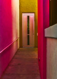
I have often photographed this narrow passageway leading to a side entrance of a local hotel. Depending upon the angle of light and the nature of the hotel’s painted colors, this scene is constantly changing. In April of 2016, it looked quite different when I photographed it in morning light. (It appears immediately after this image in this gallery at http://www.pbase.com/pnd1/image/163098158). I built that image not only around its brilliant color contrasts, but also created a composition based on the geometric shadows supplied by the angle of the sun itself.

In October of 2017, I again went back to photograph this hotel, along with a former student. I made this photograph in the late afternoon, as the sun illuminated the end of the narrow passageway from overhead. I still use geometry to organize the image, but the colors become far more important. The saturated beauty of the pink and yellow paint, turning to red and orange in the warming light, now dominates the scene.

Panasonic LUMIX DMC-LX10
1/640s f/2.8 at 25.6mm iso125 full exif

other sizes: small medium large original auto
share
Phil Douglis21-Oct-2017 19:10
Thank you, Long, for your comment on this image. This particular entryway has been a favorite of mine for many years. I return often, because the hotel managements often change and the colors change with them. This combination of yellow and pink draws the eye and sparks the imagination. I decided to slightly shift the color balance here, to deepen the pinks to create rich, almost red hues here. It may not be an "accurate" rendering of color, but instead, I create my own interpretation of coloration. I did not over saturate, as you noticed. The hues, rather than color intensity, do the work here.
Long Bach Nguyen20-Oct-2017 03:20
well seen and captured love the colors and not over saturate
Type your message and click Add Comment
It is best to login or register first but you may post as a guest.
Enter an optional name and contact email address. Name
Name Email
help private comment