


|
|
|
|
|
|
| |
| 10-MAY-2005 | |
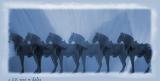
This is another version of this image. I did not like how I lost the lead horses' head in the previous. I also think this color works better. I had reduced the opacity on the lead horse and changed this to have the less opaque horses in the center. Hope this works better.
Images are copyright Rene Hales and may not be used without permission.
Rene@qx.net
| comment |
| Christine P. Newman | 15-Oct-2006 13:13 | |
| Bernd Koenemann | 04-Jan-2006 00:49 | |
| Willa Dios | 21-Nov-2005 19:25 | |
| Ron Horloff | 15-Jun-2005 19:17 | |