


|
|
|
|
|
|
| |
| 16-JUL-2008 | |
Here's as scientific an experiment that I can conduct without a studio and proper lighting.
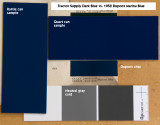
I've seen trucks painted Mariner Blue and they just look a little bit too dark for my tastes and there are already two red AD trucks in my area so I don't want another one. The only other period looking color would be Forester Green which was the standard color, but I don't care for that either.
This Tractor Supply (BPS) Dark Blue from the quart can is only slightly lighter than the Dupont sample, and I like the color. As you can see on my first test (other photo) the color is dark but carries a sharp highlight and tones nicely in good light.
Unfortunately the rattle can version is visibly lighter. It also has a different finish that you can't see in this photo... probably a different formula that works better in an aerosol. I was hoping I could use the rattle cans to paint small parts but it looks like I'll be mixing paint and cleaning guns if I don't want my truck to look like a patchwork quilt.
The neutral gray card is there as a control color. When you sample this color with a photo editing program like Photoshop it has equal parts RGB and being such all the colors in the file are as true as the technology allows. If that color does not appear neutral gray on you monitor, your monitor needs calibrating. Color is complex, more so than be covered here.
© Woody Vondracek
Please login or register.