photo sharing and upload picture albums photo forums search pictures popular photos photography help login
ctfchallenge | all galleries >> Challenge 145 - Two in One >> Challenge 145 - Exhibition > anger
previous | next
16-JUN-2007 ArminB

anger

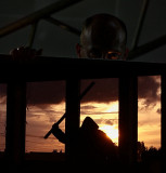
tec note: used a remote and a pocket lamp for the upper picture and the timer for the 2nd

Canon EOS 350D
1/250s f/2.8 at 75.0mm iso400 full exif

other sizes: small medium original auto
comment | share
aam1234 28-Oct-2007 09:06
Don't know whether it's on or off topic, but I know it's a great pic. Good job, Armin.
Rod 27-Oct-2007 20:54
Sorry, rule No 6 states we cannot create artificial borders. This rule was inserted just for Armin:-)
ctfchallenge27-Oct-2007 20:49
I was trying to describe possible diagonal crops instead of a horizontal one. There's enough space for it in the originals.. lots of "dark" on bottom of the top pic.
-k2
Rod 27-Oct-2007 20:18
Hang on there me Nordic luvely, if we combine two picys there's only one defining border. How can you describe two of em:-)hehe
ctfchallenge27-Oct-2007 19:02
under his hand on the left side, slanting downwards to the right, crossing the back of his nose.
The alternative one is along the bottom of what seems to be the same "ledge" - look in pending in a sec..
-k2
ctfchallenge27-Oct-2007 18:44
So where exactly is this distinct boundary?
-J.V.
ctfchallenge27-Oct-2007 15:26
Ahh this is interesting :) Challenge rule says boundary needs be straight and distinct, but not necessarily horizontal or vertical. The fingers overlap the upper, "backslash" diagonal boundary here. But there's a "slash" diagonal right below it. If that could somehow be accentuated to become visible, this qualifies IMO, even if it's minor cheating lol. As an entity, I do like this one the best (comparing to the one in eligible). But the lack of distinction between the two pictures is admittedly part of the visual attraction here.

The version is pending lost its balance, IMO. It suddenly looks too crowded on the right side. The "big" hand carries less weight when placed near the bottom, and it is suddenly placed further away from the other hand in the pictures. But worse: The guidelines of construction work that weaves the original together, suddenly become fractured. They no longer "carry" the picture. In order to maintain balance in the pending pic, the silhouette would have had to be placed further to the left, to work properly as a "counterweight". As I see it :) Quite a headache.
-k2
ctfchallenge27-Oct-2007 14:15
thanks, I see your point, tv, I will place a reversed order picture in pending 1st, as I am not really sure about its outcome :)
Armin
ctfchallenge27-Oct-2007 13:49
Armin, to my eye, placement above and below plays a major role. In the current order, I have an impression of a god above viewing with displeasure the actions below. I think the feeling of "fear" would be much enhanced if these very strong images were reversed. -tv
ctfchallenge27-Oct-2007 10:34
I've uploaded the two origs into pending :-)
Armin
ctfchallenge27-Oct-2007 10:25
which is what? This is not me holding a picture of mine, but two seperate shots combined to one for this challenge :-)
the upper picture ends with the wall of a stairway, the one below starts with a building wall with windows.
or is no.5 that my shots are always off in a more general sense ;o))
Cheers, mate
Armin
Rod 27-Oct-2007 10:04
Have you forgotten about rule No 5 Armin.......tut tut:-)