Type your message and click Add Comment
It is best to
login
or
register
first but you may post as a guest.
Enter an optional name and contact email address.
Name
Name
Email
help
private comment
ctfchallenge
|
all galleries
>>
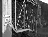
Challenge 101 - Typography
>>
C101 - Exhibition
> Who would want to? *
previous
|
next
18-FEB-2006
Ann Chaikin
Who would want to? *
Deception Pass Bridge
(Which do you prefer? Black and white or color?)
Canon EOS 20D
,
Canon EF 17-40mm f/4L USM
1/80s f/6.3 at 30.0mm iso200
full exif
other sizes:
small
medium
original
auto
previous
|
next
Please do not delete, update, or otherwise edit others' entries
* Submitter retains all copyrights *
comment
|
share
Type your message and click Add Comment
It is best to
login
or
register
first but you may post as a guest.
Enter an optional name and contact email address.
Name
Name
Email
help
private comment
alexeig
25-Feb-2006 22:45
B/W version is lacking contrast IMHO
ctfchallenge
21-Feb-2006 03:49
I'm with Mary Anne. I too find the sign to be more prominent in the B/W version.
I would find the b/w a little more appealing if it had a little more contrast to it. yep I give the b/w the edge but not by too much.
-Techo
ctfchallenge
20-Feb-2006 22:55
Ann, for whatever it's worth, I think this b & w version makes us pay more attention to the sign.
--Mary Anne