David--I posted the other version just for your critique! Many thanks in helping me determine which image to enter.
Mary Anne--The "gold" tabletop is exactly what I liked about this image. I will attempt to darken it a bit, but don't hold out too much hope for any improvement. Thanks for your observation!
Very nice shot, Shu, but I think the light on the part of the (table?) surface closest to us is a bit too glaring. The composition and design are just wonderful.
--Mary Anne
Thanks. Maybe I'll try shooting this again (different perspective). I've posted another version below which I took some time ago. All colors are heavily saturated and was taken in the days when I upped color in everything I put online. We go through phases.......! shu
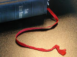
God I love your work Shu. Another beautifully executed shot. For my own personal taste I would have boosted the saturation a little bit on the red bookmark - but that's just personal preference rather than a criticism.