photo sharing and upload picture albums photo forums search pictures popular photos photography help login
ctfchallenge | all galleries >> The Best of CTF Challenges >> Best of 2005 > 3rd Place "Homeless Man" by Julian Hebbrecht
previous | next
12-JUN-2005 Julian Hebbrecht

3rd Place "Homeless Man" by Julian Hebbrecht

Osaka

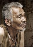
More portrait images at http://www.pbase.com/julianht/portfolio


other sizes: small medium original auto
comment | share
Julian Hebbrecht19-Jun-2005 23:09
No actions were used - that's the way he looked.
Nugar19-Jun-2005 17:21
Really Nice, Julian, what treatment did you give the image? Is this a Dragan action? (Is that the name?)
Guest 18-Jun-2005 01:06
LOL! Julian, I'm EVERYONE's strictest critic! ;) Winston Churchill said it best..."I'm not hard to please; I'm easily satisfied by the best.". ~ Lonnit
Julian Hebbrecht17-Jun-2005 10:55
Thanks Lonnit for the praise - coming from you it means a lot to me - you are my strictest critic.
No Rod, the homeless are not cared for by the government at all. These guys make a living by collecting cardboard boxes, empty cans and whatever they think theycan make a few yen from. They even have their own flea market on Sunday morning. This man was watching a baseball game on a large outdoor TV screen on a warm summer day.
ctfchallenge17-Jun-2005 00:40
I thought it was a sepiatone image from the thumbnail. Nice capture of the textures both on the face and the wall behind your subject. Markjay
Rod 16-Jun-2005 10:54
Just one thing that puzzles me about your shots of the homeless, one in exhibition & this one is that the subjects seem a lot cleaner & sort of content. Other shots I've seen of the homeless from around the world seem to make me feel some pity at their plight as they seem down & out & dirty. With your homeless shots I just appreciate the photography. Is this a Japanese thing that the homeless are better cared for than in other countries? I think the shots are excellent as general portraits all the same.
Guest 16-Jun-2005 04:37
Julian!!!!!!!! You've really nailed this one!!!!! I would have been freaking if there was a focus issue on this shot b/c it is truly outstanding! OH the tones! The face! The hair! The beads! The shirt! The background! It's a feast for the eyes!!!!!!!! ~ Lonnit
ctfchallenge14-Jun-2005 22:07
Great photo Julian. I like this background too. - andrew
Guest 14-Jun-2005 20:24
Excellent! It looks much better now in my opinion...
Guest 14-Jun-2005 16:26
I'm glad the black background is gone but I feel the real background is to light and detracts from the character of the face. I'd suggest masking the background and darkening it a bit. Still an excellent picture any way you look at it.
ctfchallenge14-Jun-2005 03:46
Yep, this is classic Julian style. I also like that you've decided on the original background, it works much better in the context of this image.

-Techo :)
janewigginsphotography14-Jun-2005 01:17
I have to agree with the quality of the composition and image and I really like this natural background - fits much better with the photo! Excellent!!!
ctfchallenge14-Jun-2005 00:03
A classic Jules. theFly
Rod 13-Jun-2005 23:52
The new background does look more natural.
Shu13-Jun-2005 23:17
Much clapping for Julian!!! This one renders me speechless! The background looks fine. (You don't need any distraction from the marvelous detail in your image.) I think you've thrown a fox into the chicken coop, Julian. LOL
Julian Hebbrecht13-Jun-2005 23:10
I agree with you, the black background was not a good idea so I replaced it again and I think this is much better. The original background was far too visually noisy.
By the way, this is not a sepia image - the colors were like that.
alexeig13-Jun-2005 22:23
Great posture and face expression. * the hue on the face together with light reflection from the face make me think about these street artists who paint their faces in bronze or silver and mimick statues
Guest 13-Jun-2005 17:39
Excellent! Great catch, I like candids, it's just great. *: don't like the background job in PShop...was the background really so disturbing?
ctfchallenge13-Jun-2005 16:17
Definitely a signature image. This one has "Julian" written all over it. Sometimes I think your photos are a tad oversharpened, but this one is perfect. The sepia tones also work well. Good shot.
--Mary Anne
ctfchallenge13-Jun-2005 14:29
A picture is worth a thousand words. That most surely applies here.
One of the best portraits I have seen here in the forums. Yvonne
Guest 13-Jun-2005 14:12
Excellent study of portraiture -Cat
ctfchallenge13-Jun-2005 13:46
i spotted this shot as yours from the thumbnail. your winner shot in "framing" challenge is one of my all time favourite photos. i admire your ability to capture details of human face. -Abstract
ps: did you have to replace the distracting background with black in this one?
Guest 13-Jun-2005 13:12
I saw the thumbnail and said to myself, "Julian." This is certainly your signature style. Another excellent photo!
Rod 13-Jun-2005 12:59
Iso said that Andy's harsh mid day shot was your signature type of shot, but after seeing this, it's these sorts of shots that have impressed me. Excellent work Julian.